Identifont

Fonts by Appearance

Fonts by Name

Fonts by Similarity

Fonts by Picture

Fonts by Designer/Publisher

Differences

TweetTweet Differences

Compare: and  

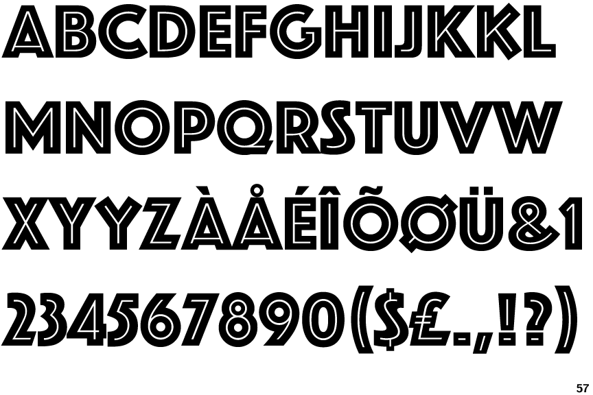
Phosphate Inline

Phosphate Inline

Closed
The '&' (ampersand) is traditional style with two enclosed loops.
Double
The diagonal strokes of the upper-case 'K' meet in a 'T'.
Square/rectangular
The dot on the '?' (question-mark) is square or rectangular.
Parallel
The verticals of the upper-case 'M' are parallel.

Note that the fonts in the icons shown above represent general examples, not necessarily the two fonts chosen for comparison.

Show Examples
Frankfurter Inline

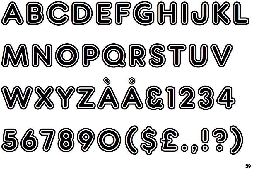
Frankfurter Inline

Gap top
The '&' (ampersand) looks like 'Et' with a gap at the top.
Single
The diagonal strokes of the upper-case 'K' meet at the vertical (with or without a gap).
Circle
The dot on the '?' (question-mark) is circular or oval.
Sloping
The verticals of the upper-case 'M' are sloping.