 |
The '4' is closed.
|
 |
The diagonal strokes of the upper-case 'K' meet at the vertical (with or without a gap).
|
 |
The 'l' (lower-case 'L') has no serifs or tail.
|
 |
The tail of the upper-case 'Q' is curved or S-shaped.
|
 |
The lower-case 'u' has no stem/serif.
|
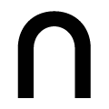 |
The lower-case 'n' has no spur or serif.
|
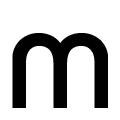 |
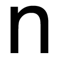
The lower-case 'm' has no spur or serif.
|
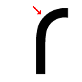 |
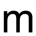
The lower-case 'r' has no spur or serif.
|
Note that the fonts in the icons shown above represent general examples, not necessarily the two fonts chosen for comparison.
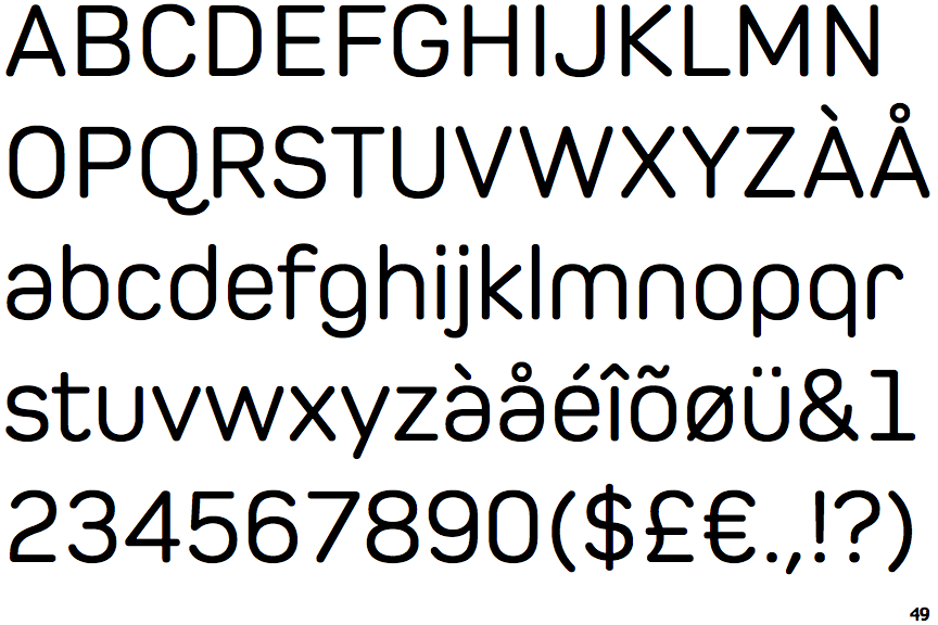
Show Examples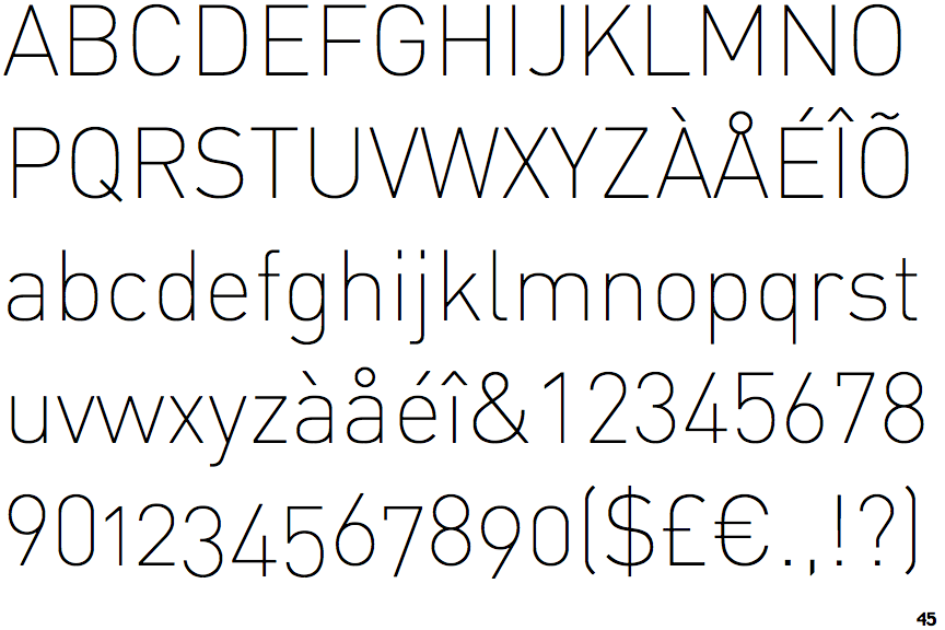
 |
The '4' is open.
|
 |
The diagonal strokes of the upper-case 'K' meet in a 'T'.
|
 |
The 'l' (lower-case 'L') has a right-facing lower serif or tail.
|
 |
The tail of the upper-case 'Q' is straight.
|
 |
The lower-case 'u' has a stem/serif.
|
 |
The lower-case 'n' has a vertical spur.
|
 |
The lower-case 'm' has a vertical spur.
|
 |
The lower-case 'r' has a vertical spur.
|