

 |
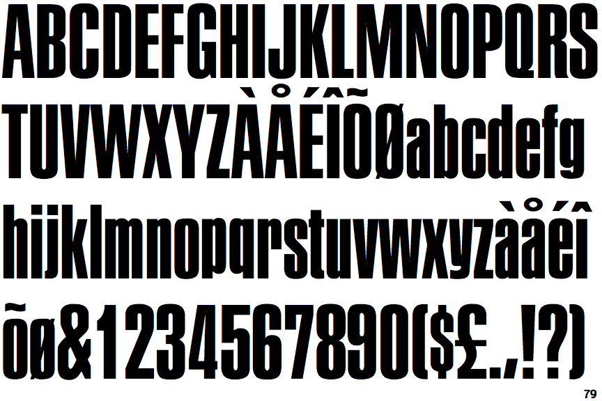
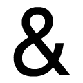
The '&' (ampersand) is traditional style with two enclosed loops.
|
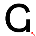 |
The upper-case 'G' has a spur/tail.
|
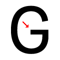 |
The upper-case 'G' has a bar to the left.
|
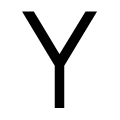 |
The upper-case 'Y' arms and tail are separate strokes.
|
 |
The upper-case 'A' has tapered verticals.
|
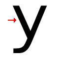 |
The sides of the lower-case 'y' are angled (V-shaped).
|
 |
The bar of the lower-case 'f' is double-sided.
|
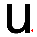 |
The lower-case 'u' has a stem/serif.
|
 |
The bar of the upper-case 'H' is vertically central.
|
 |
The centre strokes of the upper-case 'W' meet at a vertex.
|
There are more than ten differences; only the first ten are shown.
Note that the fonts in the icons shown above represent general examples, not necessarily the two fonts chosen for comparison.
Show Examples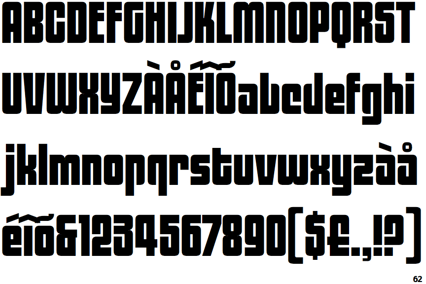
 |
The '&' (ampersand) looks like 'Et' with one enclosed loop (with or without exit stroke).
|
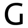 |
The upper-case 'G' has no spur/tail.
|
|
The upper-case 'G' has no bar.
|
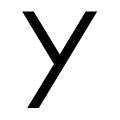 |
The upper-case 'Y' right-hand arm forms a continuous stroke with the tail.
|
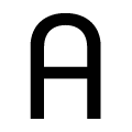 |
The upper-case 'A' has parallel verticals.
|
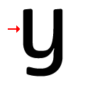 |
The sides of the lower-case 'y' are parallel (U-shaped).
|
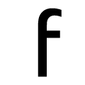 |
The bar of the lower-case 'f' is single-sided.
|
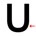 |
The lower-case 'u' has no stem/serif.
|
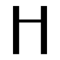 |
The bar of the upper-case 'H' is above centre.
|
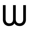 |
The centre strokes of the upper-case 'W' form one centre stroke.
|