 |
The '&' (ampersand) is traditional style with two enclosed loops.
|
 |
The verticals of the upper-case 'M' are parallel.
|
 |
The top storey of the '3' is a sharp angle.
|
 |
The leg of the upper-case 'R' is straight.
|
 |
The centre bar of the upper-case 'R' leaves a gap with the vertical.
|
 |
The lower-case 'e' is double storey.
|
 |
The bar of the lower-case 'f' is single-sided.
|
 |
The lower-case 'u' has no stem/serif.
|
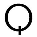 |
The tail of the upper-case 'Q' is vertical.
|
 |
The centre strokes of the upper-case 'W' meet in a T on the left.
|
Note that the fonts in the icons shown above represent general examples, not necessarily the two fonts chosen for comparison.
Show Examples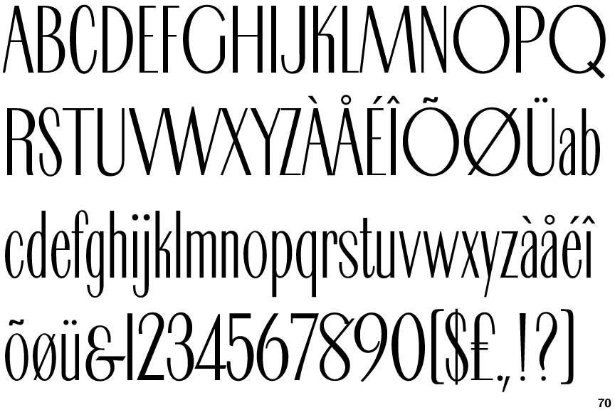
 |
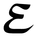
The '&' (ampersand) looks like 'Et' with a gap at the top.
|
 |
The verticals of the upper-case 'M' are sloping.
|
 |
The top storey of the '3' is a smooth curve.
|
 |
The leg of the upper-case 'R' is curved outwards.
|
 |
The centre bar of the upper-case 'R' meets the vertical.
|
 |
The lower-case 'e' has a straight horizontal bar.
|
 |
The bar of the lower-case 'f' is double-sided.
|
 |
The lower-case 'u' has a stem/serif.
|
 |
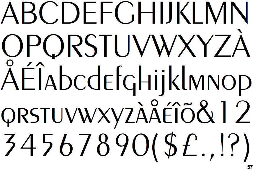
The tail of the upper-case 'Q' is slanted.
|
 |
The centre strokes of the upper-case 'W' meet at a vertex.
|