 |
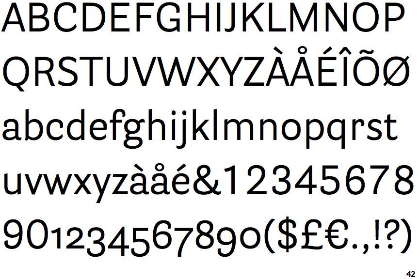
The centre vertex of the upper-case 'M' is on the baseline.
|
 |
The 'l' (lower-case 'L') has no serifs or tail.
|
 |
The stem of the '7' is curved inwards.
|
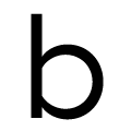 |
The bowl of the lower-case 'b' is a flattened circle or ellipse.
|
 |
The bowl of the lower-case 'd' is a flattened circle or ellipse.
|
 |
The bowl of the lower-case 'p' is a flattened circle or ellipse.
|
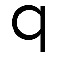 |
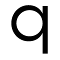
The bowl of the lower-case 'q' is a flattened circle or ellipse.
|
Note that the fonts in the icons shown above represent general examples, not necessarily the two fonts chosen for comparison.
Show Examples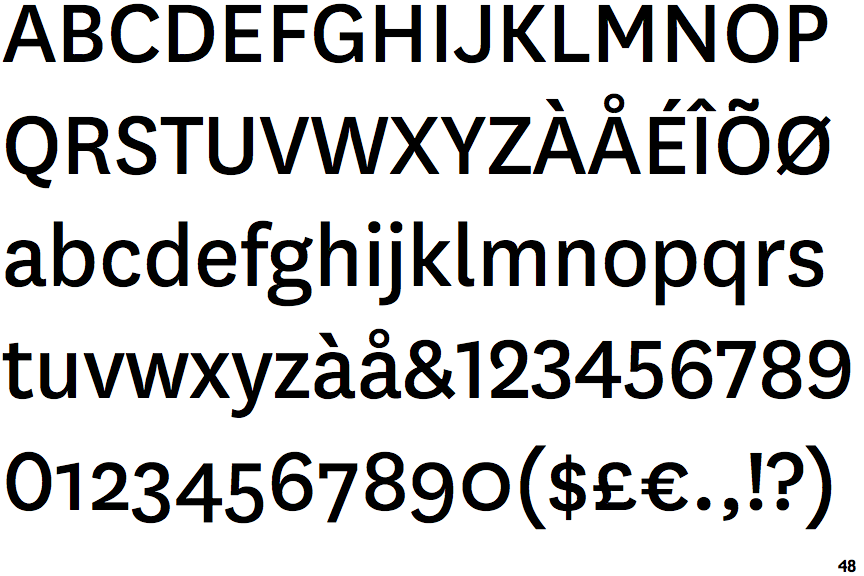
 |
The centre vertex of the upper-case 'M' is above the baseline.
|
 |
The 'l' (lower-case 'L') has a right-facing lower serif or tail.
|
 |
The stem of the '7' is straight.
|
 |
The bowl of the lower-case 'b' is a circle or ellipse.
|
 |
The bowl of the lower-case 'd' is a circle or ellipse.
|
 |
The bowl of the lower-case 'p' is a circle or ellipse.
|
 |
The bowl of the lower-case 'q' is a circle or ellipse.
|