 |
The upper-case 'Q' tail touches the circle.
|
 |
The centre bar of the upper-case 'P' leaves a gap with the vertical.
|
 |
The lower-case 'a' stem stops at the top of the bowl (single storey).
|
 |
The upper-case 'J' has no bar.
|
 |
The top of the lower-case 'q' has no spur or serif.
|
 |
The centre bar of the upper-case 'R' leaves a gap with the vertical.
|
 |
The bar of the lower-case 'f' is single-sided.
|
 |
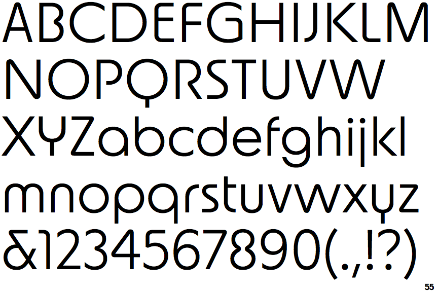
The lower-case 't' has a single-sided bar.
|
 |
The junction of the upper-case 'K' leaves a visible gap with the vertical.
|
 |
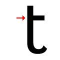
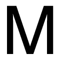
The upper-case 'M' vertices are rounded at the top and bottom.
|
There are more than ten differences; only the first ten are shown.
Note that the fonts in the icons shown above represent general examples, not necessarily the two fonts chosen for comparison.
Show Examples
 |
The upper-case 'Q' tail crosses the circle.
|
 |
The centre bar of the upper-case 'P' meets the vertical.
|
 |
The lower-case 'a' stem curves over the top of the bowl (double storey).
|
 |
The upper-case 'J' has a bar to the left.
|
 |
The top of the lower-case 'q' has a vertical or slightly angled spur (pointed or flat).
|
 |
The centre bar of the upper-case 'R' meets the vertical.
|
 |
The bar of the lower-case 'f' is double-sided.
|
 |
The lower-case 't' has double-sided bar which forms a right-angle with the vertical.
|
 |
The junction of the upper-case 'K' touches the vertical.
|
 |
The upper-case 'M' vertices are flat at the top and bottom.
|