 |
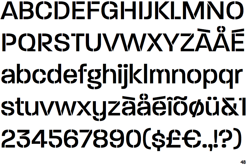
The centre vertex of the upper-case 'M' is on the baseline.
|
 |
The dot on the '?' (question-mark) is circular or oval.
|
|
The verticals of the upper-case 'M' are parallel.
|
 |
The characters are solid.
|
 |
The hole (counter) in the upper-case 'P' or 'R' is approximately D-shaped.
|
Note that the fonts in the icons shown above represent general examples, not necessarily the two fonts chosen for comparison.
Show Examples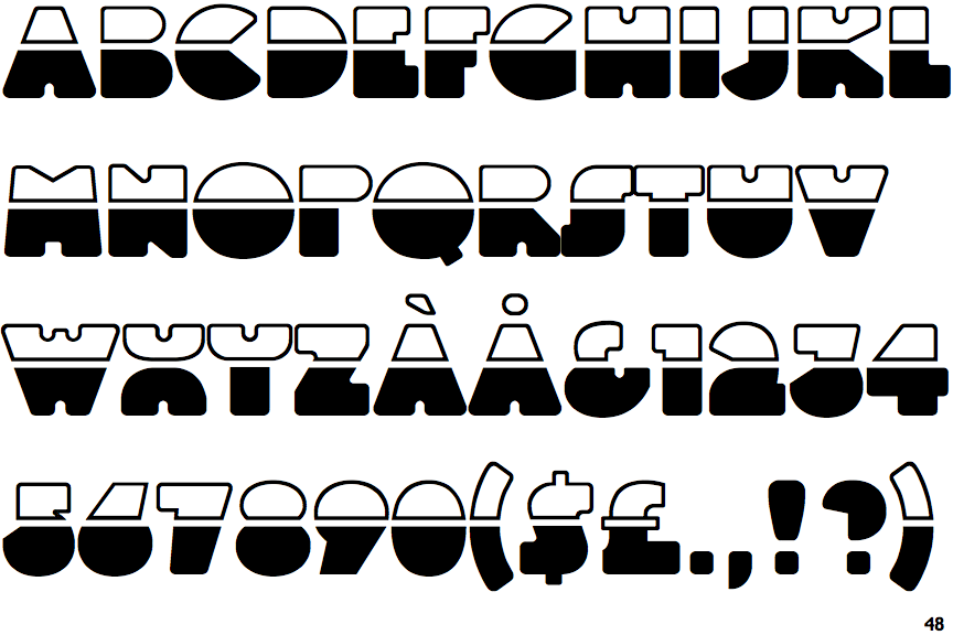
 |
The centre vertex of the upper-case 'M' is above the baseline.
|
 |
The dot on the '?' (question-mark) is square or rectangular.
|
 |
The verticals of the upper-case 'M' are sloping.
|
 |
The characters are outlined, shaded, or filled with a pattern.
|
 |
The hole (counter) in the upper-case 'P' or 'R' is filled (no counter).
|