 |
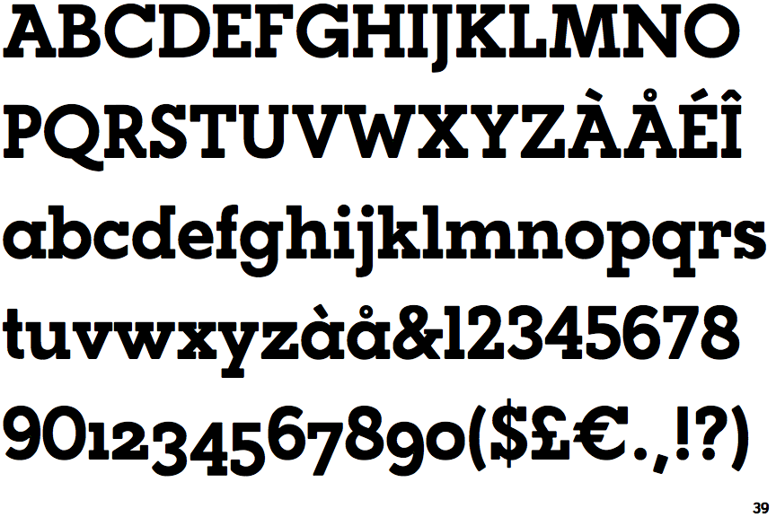
The '&' (ampersand) is traditional style with two enclosed loops.
|
 |
The upper-case 'J' descends below the baseline.
|
 |
The diagonal strokes of the upper-case 'K' meet in a 'T'.
|
 |
The dot on the '?' (question-mark) is circular or oval.
|
 |
The verticals of the upper-case 'M' are sloping.
|
 |
The lower-case 'a' stem stops at the top of the bowl (single storey).
|
 |
The top of the upper-case 'A' has a serif or cusp on the left.
|
 |
The centre vertex of the upper-case 'W' has no serifs.
|
 |
The dot on the lower-case 'i' or 'j' is circular or oval.
|
 |
The feet of the lower-case 'h' have two serifs on each foot.
|
Note that the fonts in the icons shown above represent general examples, not necessarily the two fonts chosen for comparison.
Show Examples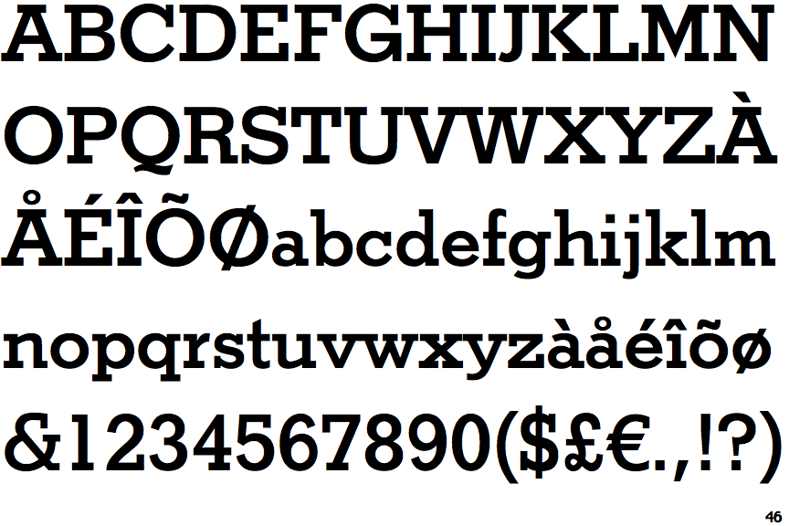
 |
The '&' (ampersand) is traditional style with a gap at the top.
|
 |
The upper-case 'J' sits on the baseline.
|
 |
The diagonal strokes of the upper-case 'K' meet at the vertical (with or without a gap).
|
 |
The dot on the '?' (question-mark) is square or rectangular.
|
 |
The verticals of the upper-case 'M' are parallel.
|
 |
The lower-case 'a' stem curves over the top of the bowl (double storey).
|
 |
The top of the upper-case 'A' has serifs both sides, or a top bar.
|
 |
The centre vertex of the upper-case 'W' has two separate serifs.
|
 |
The dot on the lower-case 'i' or 'j' is square or rectangular.
|
 |
The feet of the lower-case 'h' have two serifs on the left and one on the right.
|