
 |
The '&' (ampersand) looks like 'Et' with a gap at the top.
|
 |
The characters have serifs.
|
 |
The '4' is closed.
|
 |
The centre bar of the upper-case 'P' meets the vertical.
|
 |
The upper-case 'U' has no stem/serif.
|
 |
The characters are solid.
|
 |
The upper-case 'Y' arms and tail are separate strokes.
|
 |
The centre bar of the upper-case 'R' meets the vertical.
|
 |
The '7' has no bar.
|
 |
The foot of the '£' (pound) has a loop.
|
Note that the fonts in the icons shown above represent general examples, not necessarily the two fonts chosen for comparison.
Show Examples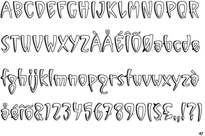
 |
The '&' (ampersand) is traditional style with two enclosed loops.
|
 |
The characters do not have serifs.
|
 |
The '4' is open.
|
 |
The centre bar of the upper-case 'P' crosses the vertical.
|
 |
The upper-case 'U' has a stem/serif.
|
 |
The characters are outlined, shaded, or filled with a pattern.
|
 |
The upper-case 'Y' right-hand arm forms a continuous stroke with the tail.
|
 |
The centre bar of the upper-case 'R' crosses the vertical.
|
 |
The '7' has a bar.
|
 |
The foot of the '£' (pound) has no loop.
|