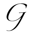
 |
The upper-case 'Q' tail crosses the circle.
|
 |
The '&' (ampersand) is traditional style with two enclosed loops.
|
 |
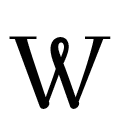
The top of the upper-case 'W' has three upper terminals.
|
 |
The tail of the upper-case 'T' curves to the left.
|
 |
The top of the upper-case 'W' has three upper terminals.
|
 |
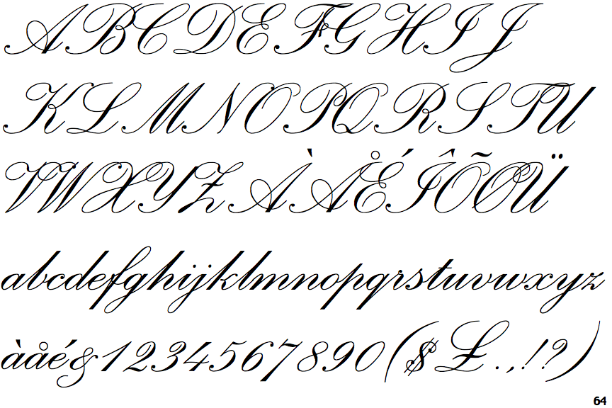
The upper-case 'A' right-hand vertical loops to form the bar.
|
 |
The stroke of the 'l' (lower-case 'L') has no loop.
|
 |
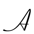
The upper-case 'H' bar is continuous with both verticals.
|
 |
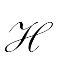
The upper-case 'G' tail is backward pointing, no loop.
|
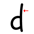 |
The stroke of the 'd' has no loop.
|
There are more than ten differences; only the first ten are shown.
Note that the fonts in the icons shown above represent general examples, not necessarily the two fonts chosen for comparison.
Show Examples
 |
The upper-case 'Q' tail touches the circle.
|
 |
The '&' (ampersand) looks like 'Et' with a gap at the top.
|
 |
The top of the upper-case 'W' has an open loop.
|
 |
The tail of the upper-case 'T' is straight.
|
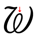 |
The top of the upper-case 'W' has an enclosed loop.
|
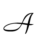 |
The upper-case 'A' left-hand vertical loops to form the bar.
|
 |
The stroke of the 'l' (lower-case 'L') has a loop.
|
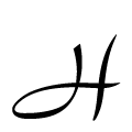 |
The upper-case 'H' left vertical loops to form the bar.
|
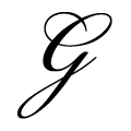 |
The upper-case 'G' tail is backward pointing, looped.
|
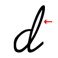 |
The stroke of the 'd' has a loop.
|