 |
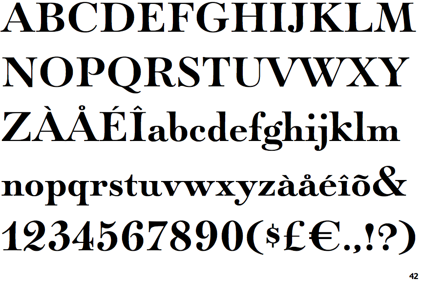
The '$' (dollar) has a single line which does not cross the 'S'.
|
 |
The '&' (ampersand) is traditional style with two enclosed loops.
|
 |
The upper-case 'J' sits on the baseline.
|
 |
The centre vertex of the upper-case 'M' is on the baseline.
|
 |
The centre bar of the upper-case 'P' leaves a gap with the vertical.
|
 |
The top of the upper-case 'A' has no serifs or cusps.
|
 |
The centre bar of the upper-case 'R' meets the vertical.
|
 |
The tail of the upper-case 'J' has a rounded end or ball.
|
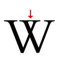 |
The serifs of the upper-case 'W' are joined in the centre.
|
 |
The foot of the '£' (pound) has no loop.
|
Note that the fonts in the icons shown above represent general examples, not necessarily the two fonts chosen for comparison.
Show Examples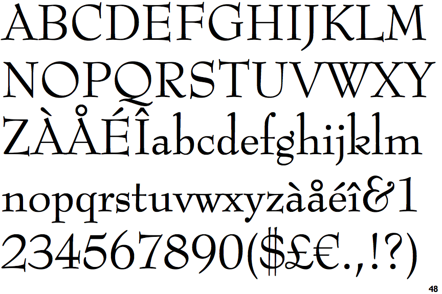
 |
The '$' (dollar) has a double line crossing the 'S'.
|
 |
The '&' (ampersand) looks like 'Et' with a gap at the top.
|
 |
The upper-case 'J' descends below the baseline.
|
 |
The centre vertex of the upper-case 'M' is above the baseline.
|
 |
The centre bar of the upper-case 'P' meets the vertical.
|
 |
The top of the upper-case 'A' has a serif or cusp on the left.
|
 |
The centre bar of the upper-case 'R' leaves a gap with the vertical.
|
 |
The tail of the upper-case 'J' has a tapered end.
|
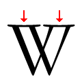 |
The serifs of the upper-case 'W' are joined on the left and right.
|
 |
The foot of the '£' (pound) has a loop.
|