
 |
The upper-case 'J' sits on the baseline.
|
 |
The centre bar of the upper-case 'P' leaves a gap with the vertical.
|
 |
The upper-case 'G' has a bar to the left.
|
 |
The upper-case 'Y' right-hand arm forms a continuous stroke with the tail.
|
 |
The upper-case 'E' is drawn as a 'C' with a bar.
|
 |
The strokes are sloped right (italic, oblique, or cursive).
|
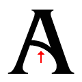 |
The bar of the upper-case 'A' is a curved or slanted line.
|
Note that the fonts in the icons shown above represent general examples, not necessarily the two fonts chosen for comparison.
Show Examples
 |
The upper-case 'J' descends below the baseline.
|
 |
The centre bar of the upper-case 'P' meets the vertical.
|
 |
The upper-case 'G' has no bar.
|
 |
The upper-case 'Y' arms and tail are separate strokes.
|
 |
The upper-case 'E' is normal letter shape.
|
 |
The strokes are upright.
|
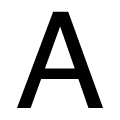 |
The bar of the upper-case 'A' is a single horizontal line.
|