 |
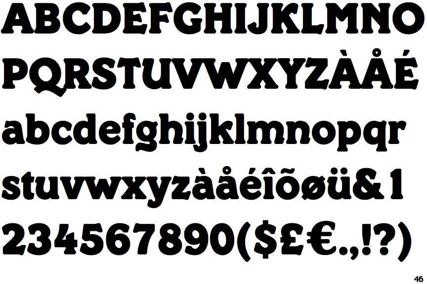
The upper-case 'Q' tail touches the circle.
|
 |
The '&' (ampersand) is traditional style with a gap at the top.
|
 |
The '4' is open.
|
 |
The upper-case 'U' has a stem/serif.
|
 |
The top of the upper-case 'A' has no serifs or cusps.
|
 |
The sides of the lower-case 'y' are angled (V-shaped).
|
 |
The centre vertex of the upper-case 'W' has no serifs.
|
 |
The lower storey of the lower-case 'g' has a gap.
|
 |
The '7' has no bar.
|
Note that the fonts in the icons shown above represent general examples, not necessarily the two fonts chosen for comparison.
Show Examples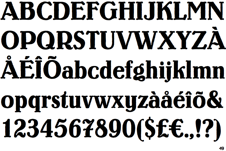
 |
The upper-case 'Q' tail crosses the circle.
|
 |
The '&' (ampersand) is traditional style with two enclosed loops.
|
 |
The '4' is closed.
|
 |
The upper-case 'U' has no stem/serif.
|
 |
The top of the upper-case 'A' has a serif or cusp on the left.
|
 |
The sides of the lower-case 'y' are parallel (U-shaped).
|
 |
The centre vertex of the upper-case 'W' has two separate serifs.
|
 |
The lower storey of the lower-case 'g' has no gap.
|
 |
The '7' has a bar.
|