Differences
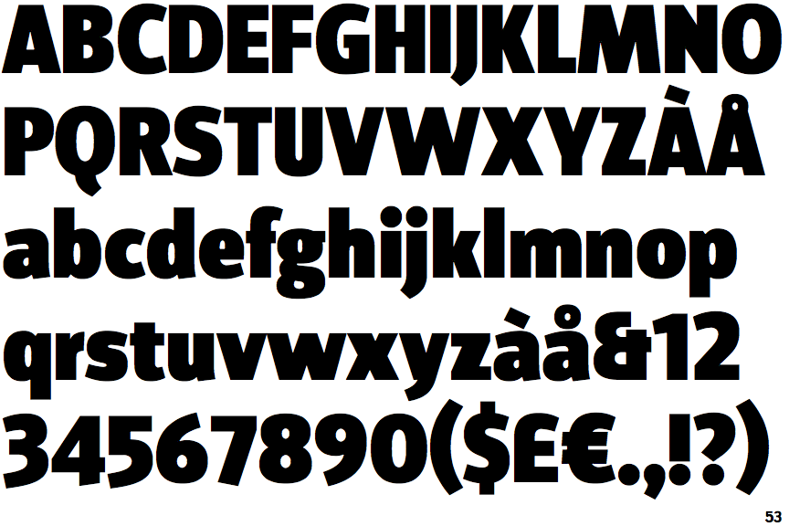
PTL Qugard Sans Black LF
 |
The '$' (dollar) has a single line which does not cross the 'S'.
|
 |
The '&' (ampersand) looks like 'Et' with one enclosed loop (with or without exit stroke).
|
 |
The centre vertex of the upper-case 'M' is on the baseline.
|
 |
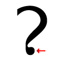
The dot on the '?' (question-mark) is circular or oval.
|
 |
The verticals of the upper-case 'M' are sloping.
|
 |
The lower-case 'g' is double-storey (with or without gap).
|
 |
The upper-case 'G' has a bar to the left.
|
 |
The leg of the upper-case 'R' is straight.
|
 |
The top of the lower-case 'q' has a vertical or slightly angled spur (pointed or flat).
|
 |
The tail of the upper-case 'Q' is curved, S-shaped, or Z-shaped.
|
There are more than ten differences; only the first ten are shown.
Note that the fonts in the icons shown above represent general examples, not necessarily the two fonts chosen for comparison.
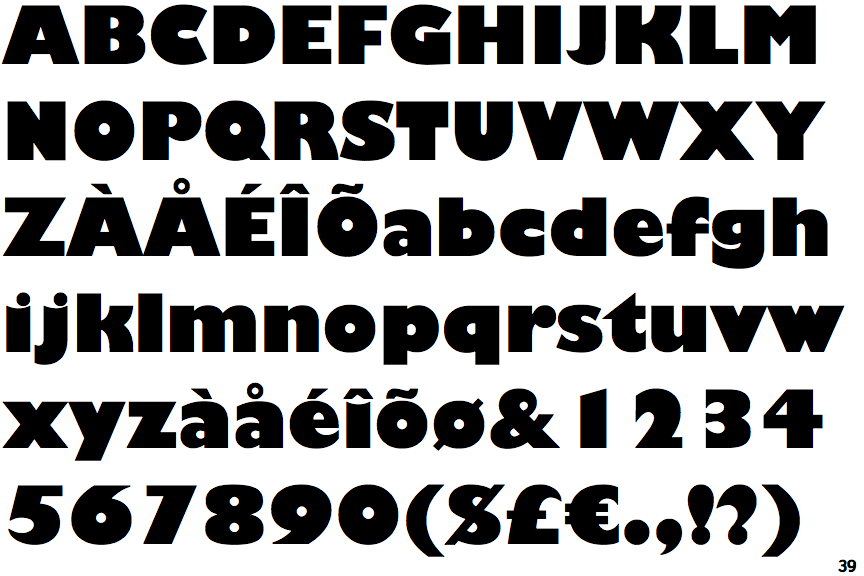
Show ExamplesGill Sans Ultra Bold
 |
The '$' (dollar) has a single line crossing the 'S'.
|
 |
The '&' (ampersand) is traditional style with two enclosed loops.
|
 |
The centre vertex of the upper-case 'M' is above the baseline.
|
 |
The dot on the '?' (question-mark) is joined to the stroke or missing.
|
 |
The verticals of the upper-case 'M' are parallel.
|
 |
The lower-case 'g' is single-storey (with or without loop).
|
 |
The upper-case 'G' has no bar.
|
 |
The leg of the upper-case 'R' is curved outwards.
|
 |
The top of the lower-case 'q' has no spur or serif.
|
 |
The tail of the upper-case 'Q' is straight (horizontal, diagonal, or vertical).
|

