 |
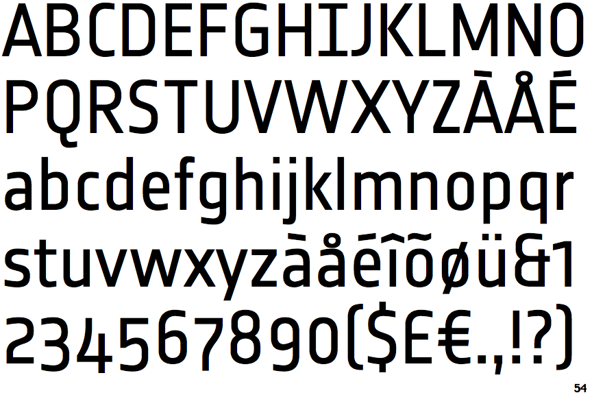
The '&' (ampersand) looks like 'Et' with one enclosed loop (with or without exit stroke).
|
 |
The '4' is open.
|
 |
The centre vertex of the upper-case 'M' is above the baseline.
|
 |
The lower-case 'a' stem curves over the top of the bowl (double storey).
|
 |
The upper-case 'J' has no bar.
|
 |
The upper-case 'A' has tapered verticals.
|
 |
The upper-case 'E' is normal letter shape.
|
 |
The sides of the lower-case 'y' are angled (V-shaped).
|
 |
The bar of the lower-case 'f' is double-sided.
|
 |
The tail of the lower-case 'f' sits on the baseline.
|
Note that the fonts in the icons shown above represent general examples, not necessarily the two fonts chosen for comparison.
Show Examples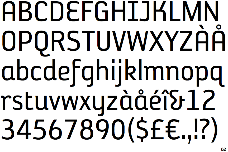
 |
The '&' (ampersand) looks like 'Et' with a gap at the top.
|
 |
The '4' is closed.
|
 |
The centre vertex of the upper-case 'M' is on the baseline.
|
 |
The lower-case 'a' stem stops at the top of the bowl (single storey).
|
 |
The upper-case 'J' has a bar to the left.
|
 |
The upper-case 'A' has parallel verticals.
|
 |
The upper-case 'E' is drawn as a single stroke (with or without loop).
|
 |
The sides of the lower-case 'y' are parallel (U-shaped).
|
 |
The bar of the lower-case 'f' is single-sided.
|
 |
The tail of the lower-case 'f' descends below the baseline.
|