 |
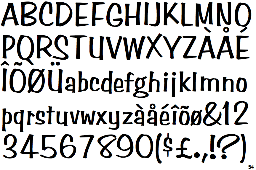
The upper-case 'Q' tail touches the circle.
|
 |
The '$' (dollar) has a single line which does not cross the 'S'.
|
 |
The '4' is closed.
|
 |
The verticals of the upper-case 'M' are parallel.
|
 |
The lower-case 'g' is double-storey (with or without gap).
|
 |
The upper-case 'U' has a stem/serif.
|
 |
The upper-case 'Y' arms and tail are separate strokes.
|
 |
The lower-case 'u' has a stem/serif.
|
 |
The '7' has no bar.
|
 |
The upper-case letter 'I' is plain.
|
There are more than ten differences; only the first ten are shown.
Note that the fonts in the icons shown above represent general examples, not necessarily the two fonts chosen for comparison.
Show Examples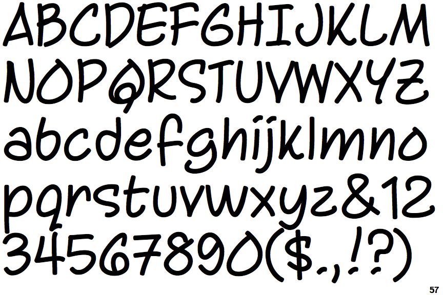
 |
The upper-case 'Q' tail crosses the circle.
|
 |
The '$' (dollar) has a single line crossing the 'S'.
|
 |
The '4' is open.
|
 |
The verticals of the upper-case 'M' are sloping.
|
 |
The lower-case 'g' is single-storey (with or without loop).
|
 |
The upper-case 'U' has no stem/serif.
|
 |
The upper-case 'Y' right-hand arm forms a continuous stroke with the tail.
|
 |
The lower-case 'u' has no stem/serif.
|
 |
The '7' has a bar.
|
 |
The upper-case letter 'I' has serifs/bars.
|