 |
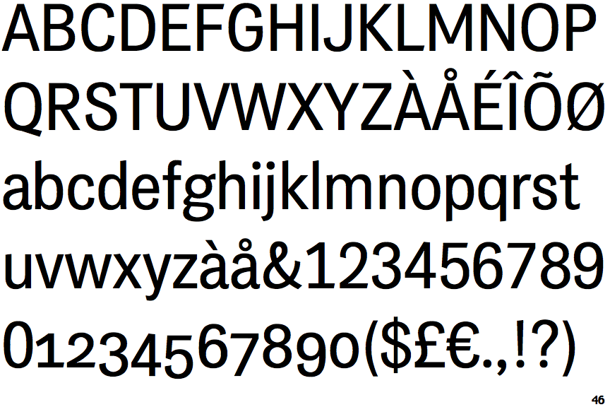
The '4' is closed.
|
 |
The centre vertex of the upper-case 'M' is above the baseline.
|
 |
The tail of the lower-case 'y' is curved or U-shaped to the left.
|
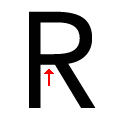 |
The leg of the upper-case 'R' is separated from the vertical by a distinct horizontal section.
|
Note that the fonts in the icons shown above represent general examples, not necessarily the two fonts chosen for comparison.
Show Examples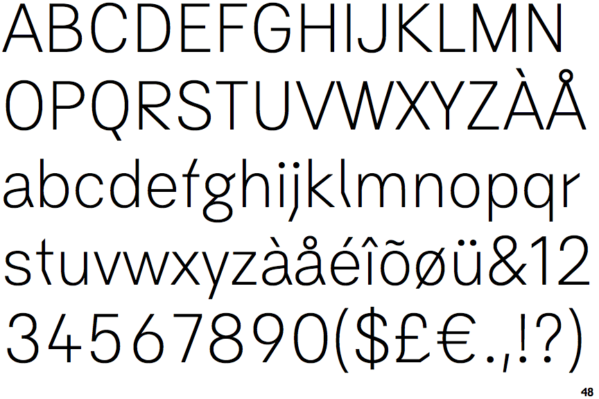
 |
The '4' is open.
|
 |
The centre vertex of the upper-case 'M' is on the baseline.
|
 |
The tail of the lower-case 'y' is substantially straight.
|
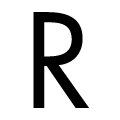 |
The leg of the upper-case 'R' meets the vertical.
|