 |
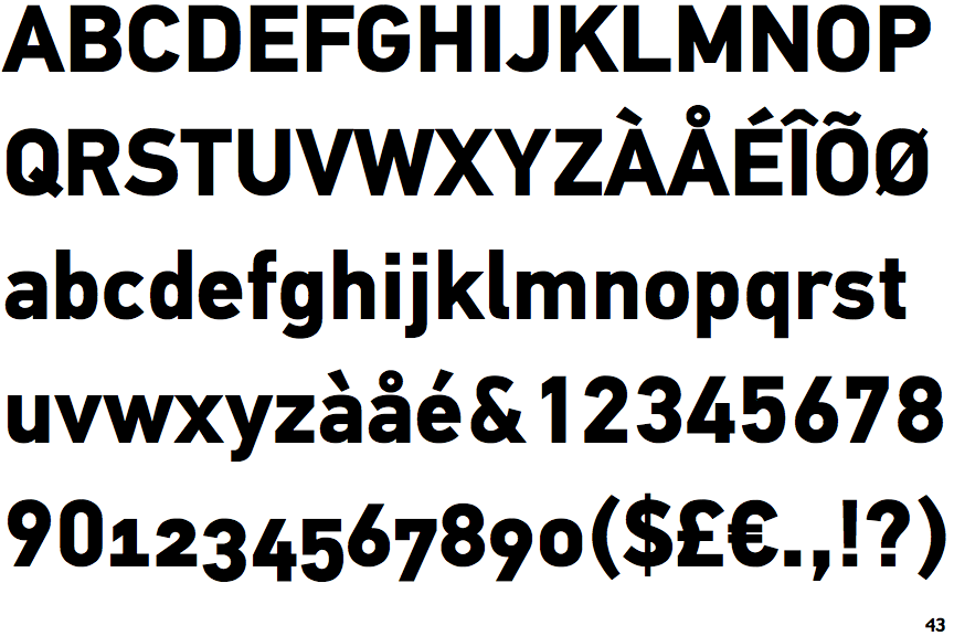
The '&' (ampersand) is traditional style with a gap at the top.
|
 |
The '4' is open.
|
 |
The centre vertex of the upper-case 'M' is above the baseline.
|
 |
The upper-case 'G' has no spur/tail.
|
 |
The 'l' (lower-case 'L') has a right-facing lower serif or tail.
|
 |
The leg of the upper-case 'R' is straight.
|
Note that the fonts in the icons shown above represent general examples, not necessarily the two fonts chosen for comparison.
Show Examples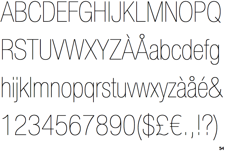
 |
The '&' (ampersand) is traditional style with two enclosed loops.
|
 |
The '4' is closed.
|
 |
The centre vertex of the upper-case 'M' is on the baseline.
|
 |
The upper-case 'G' has a spur/tail.
|
 |
The 'l' (lower-case 'L') has no serifs or tail.
|
 |
The leg of the upper-case 'R' is curved outwards.
|