 |
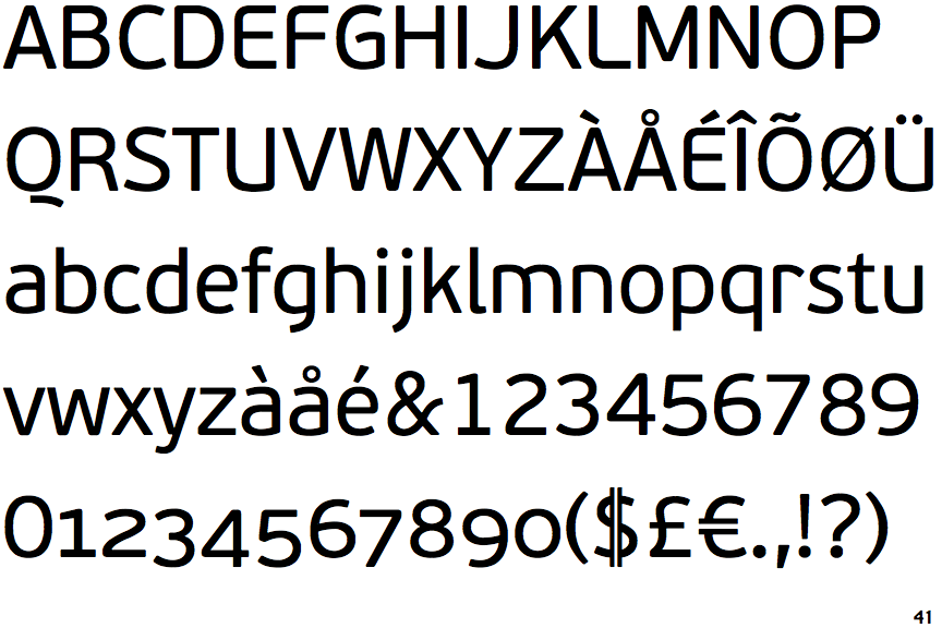
The upper-case 'Q' tail is below and separated from the circle.
|
 |
The '$' (dollar) has a double line crossing the 'S'.
|
 |
The diagonal strokes of the upper-case 'K' meet in a 'T'.
|
 |
The top storey of the '3' is a smooth curve.
|
 |
The upper-case 'G' has a bar to the left.
|
 |
The leg of the upper-case 'R' is curved outwards.
|
 |
The sides of the lower-case 'y' are angled (V-shaped).
|
 |
The lower-case 'u' has no stem/serif.
|
 |
The lower-case 'i' has no serifs or tail.
|
Note that the fonts in the icons shown above represent general examples, not necessarily the two fonts chosen for comparison.
Show Examples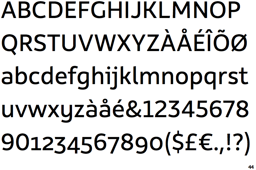
 |
The upper-case 'Q' tail touches the circle.
|
 |
The '$' (dollar) has a single line which does not cross the 'S'.
|
 |
The diagonal strokes of the upper-case 'K' connect to the vertical via a horizontal bar.
|
 |
The top storey of the '3' is a sharp angle.
|
 |
The upper-case 'G' has no bar.
|
 |
The leg of the upper-case 'R' is straight.
|
 |
The sides of the lower-case 'y' are parallel (U-shaped).
|
 |
The lower-case 'u' has a stem/serif.
|
 |
The lower-case 'i' has a left-facing upper serif.
|