Differences
PF Baseline
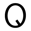 |
The upper-case 'Q' tail extends into or lies inside the circle.
|
 |
The '$' (dollar) has a double line crossing the 'S'.
|
 |
The diagonal strokes of the upper-case 'K' connect to the vertical via a horizontal bar.
|
 |
The lower-case 'g' is double-storey (with or without gap).
|
 |
The upper-case 'Y' right-hand arm forms a continuous stroke with the tail.
|
 |
The 'l' (lower-case 'L') has a right-facing lower serif or tail.
|
 |
The lower-case 'e' has a straight horizontal bar.
|
 |
The dot on the lower-case 'i' or 'j' is circular or oval.
|
 |
The upper-case letter 'I' has serifs/bars.
|
 |
The lower-case 'i' has a right-facing lower serif or tail.
|
Note that the fonts in the icons shown above represent general examples, not necessarily the two fonts chosen for comparison.
Show ExamplesEF Handel Gothic
 |
The upper-case 'Q' tail touches the circle.
|
 |
The '$' (dollar) has a single line crossing the 'S'.
|
 |
The diagonal strokes of the upper-case 'K' meet at the vertical (with or without a gap).
|
 |
The lower-case 'g' is single-storey (with or without loop).
|
 |
The upper-case 'Y' arms and tail are separate strokes.
|
 |
The 'l' (lower-case 'L') has no serifs or tail.
|
 |
The lower-case 'e' is drawn as a 'c' with a bar.
|
 |
The dot on the lower-case 'i' or 'j' is square or rectangular.
|
 |
The upper-case letter 'I' is plain.
|
 |
The lower-case 'i' has no serifs or tail.
|
