 |
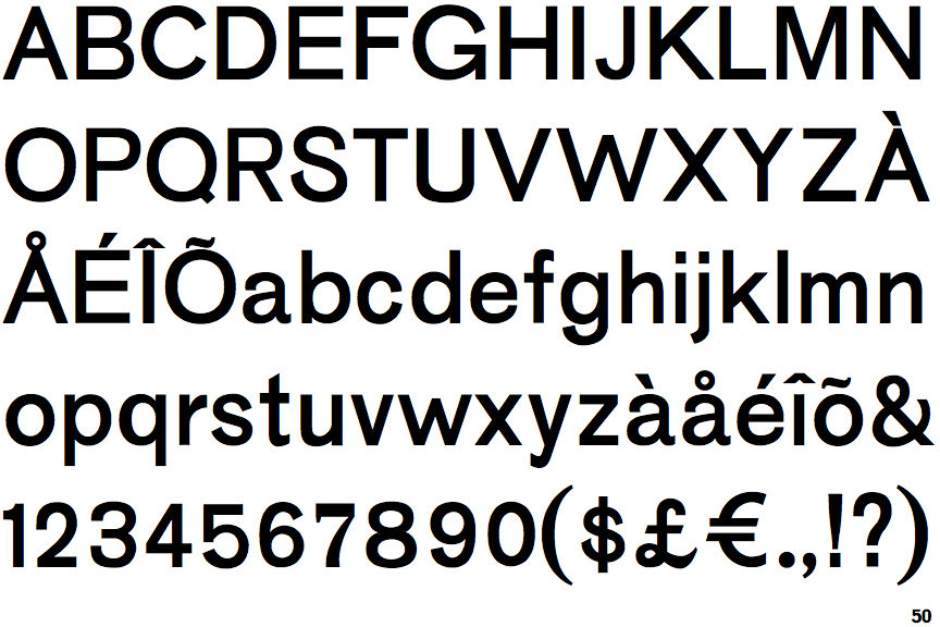
The upper-case 'Q' tail touches the circle.
|
 |
The '$' (dollar) has a single line crossing the 'S'.
|
 |
The '4' is closed.
|
 |
The lower-case 'g' is single-storey (with or without loop).
|
 |
The upper-case 'G' has a bar to the left.
|
 |
The leg of the upper-case 'R' is straight.
|
 |
The top of the '7' has a downward-pointing serif or bar.
|
 |
The top of the upper-case 'W' has three upper terminals.
|
Note that the fonts in the icons shown above represent general examples, not necessarily the two fonts chosen for comparison.
Show Examples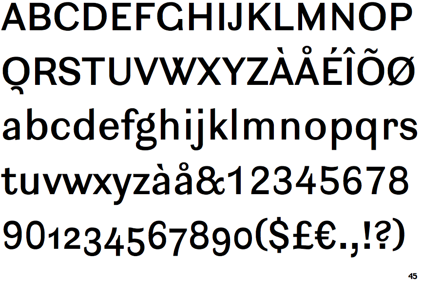
 |
The upper-case 'Q' tail is below and separated from the circle.
|
 |
The '$' (dollar) has a single line which does not cross the 'S'.
|
 |
The '4' is open.
|
 |
The lower-case 'g' is double-storey (with or without gap).
|
 |
The upper-case 'G' has no bar.
|
 |
The leg of the upper-case 'R' is curved outwards.
|
 |
The top of the '7' has no serif or bar.
|
 |
The top of the upper-case 'W' has four upper terminals.
|