Identifont

Fonts by Appearance

Fonts by Name

Fonts by Similarity

Fonts by Picture

Fonts by Designer/Publisher

Differences

TweetTweet Differences

Compare: and  

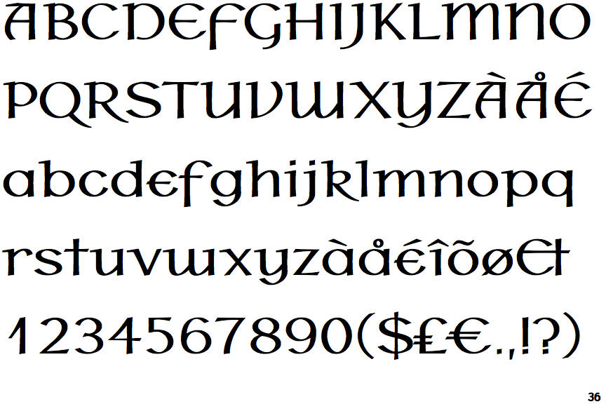
P22 Hoy Bold

P22 Hoy Bold

Round
The top storey of the '3' is a smooth curve.
Two
The upper-case 'Y' right-hand arm forms a continuous stroke with the tail.
Straight
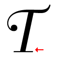
The tail of the upper-case 'T' is straight.

Note that the fonts in the icons shown above represent general examples, not necessarily the two fonts chosen for comparison.

Show Examples
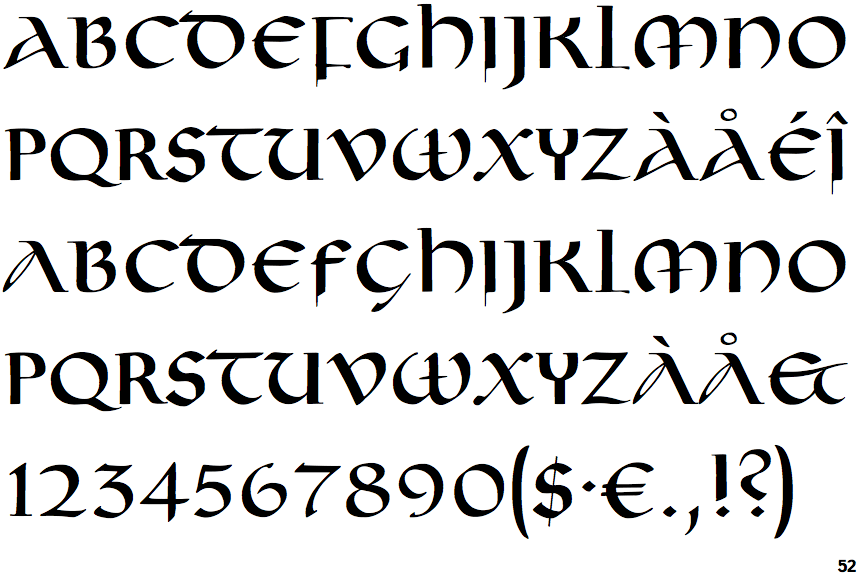
FF Lukrezia

FF Lukrezia

Angled
The top storey of the '3' is a sharp angle.
Three
The upper-case 'Y' arms and tail are separate strokes.
Right
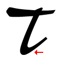
The tail of the upper-case 'T' curves to the right.