Identifont

Fonts by Appearance

Fonts by Name

Fonts by Similarity

Fonts by Picture

Fonts by Designer/Publisher

Differences

TweetTweet Differences

Compare: and  

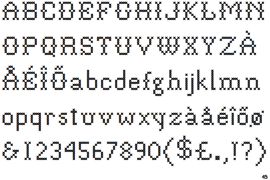
P22 Folk Art Cross

P22 Folk Art Cross

Gap top
The '&' (ampersand) looks like 'Et' with a gap at the top.
Closed
The '4' is closed.
Round
The top storey of the '3' is a smooth curve.
No top serif
The top stroke of the upper-case 'C' has no upward-pointing serif.
Both
The centre vertex of the upper-case 'W' has two separate serifs.

Note that the fonts in the icons shown above represent general examples, not necessarily the two fonts chosen for comparison.

Show Examples
Intimo One

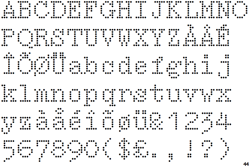
Intimo One

Closed
The '&' (ampersand) is traditional style with two enclosed loops.
Open
The '4' is open.
Angled
The top storey of the '3' is a sharp angle.
Top serif
The top stroke of the upper-case 'C' has a vertical or angled upward-pointing serif.
None
The centre vertex of the upper-case 'W' has no serifs.