Identifont

Fonts by Appearance

Fonts by Name

Fonts by Similarity

Fonts by Picture

Fonts by Designer/Publisher

Differences

TweetTweet Differences

Compare: and  

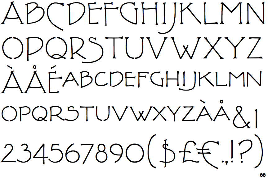
P22 FLW Terracotta

P22 FLW Terracotta

Closed
The '&' (ampersand) is traditional style with two enclosed loops.
Below
The upper-case 'J' descends below the baseline.
Round
The top storey of the '3' is a smooth curve.
Serifs
The upper-case letter 'I' has serifs/bars.

Note that the fonts in the icons shown above represent general examples, not necessarily the two fonts chosen for comparison.

Show Examples
P22 Arts and Crafts Tall

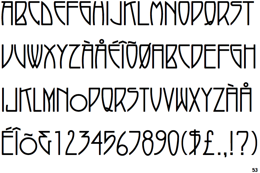
P22 Arts and Crafts Tall

Gap top
The '&' (ampersand) looks like 'Et' with a gap at the top.
On
The upper-case 'J' sits on the baseline.
Angled
The top storey of the '3' is a sharp angle.
Plain
The upper-case letter 'I' is plain.