 |
The upper-case 'Q' tail touches the circle.
|
 |
The centre bar of the upper-case 'P' meets the vertical.
|
 |
The upper-case 'U' has no stem/serif.
|
 |
The upper-case 'G' has double-sided bar.
|
 |
The upper-case 'Y' arms and tail are separate strokes.
|
 |
The top of the upper-case 'A' has serifs both sides, or a top bar.
|
 |
The upper-case 'J' has a bar to the left.
|
 |
The foot of the '4' has no serifs.
|
 |
The bar of the upper-case 'G' is double-sided.
|
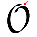 |
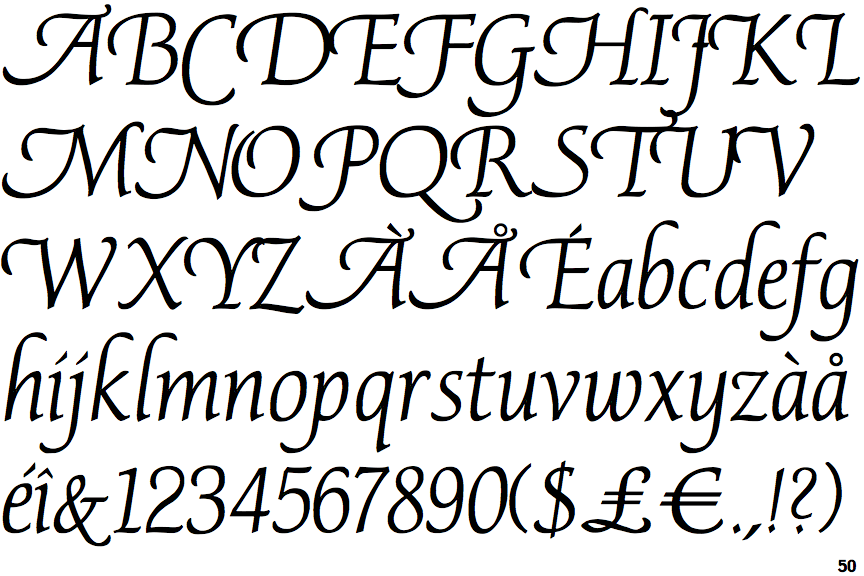
The upper-case letter 'O' has a discontinuity or gap.
|
There are more than ten differences; only the first ten are shown.
Note that the fonts in the icons shown above represent general examples, not necessarily the two fonts chosen for comparison.
Show Examples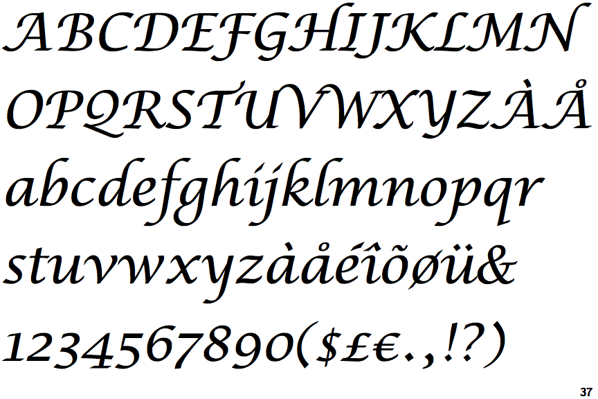
 |
The upper-case 'Q' tail forms part of the stroke of an open circle.
|
 |
The centre bar of the upper-case 'P' leaves a gap with the vertical.
|
 |
The upper-case 'U' has a stem/serif.
|
 |
The upper-case 'G' has a bar to the left.
|
 |
The upper-case 'Y' right-hand arm forms a continuous stroke with the tail.
|
 |
The top of the upper-case 'A' has a serif or cusp on the left.
|
 |
The upper-case 'J' has a bar both sides.
|
 |
The foot of the '4' has double-sided serifs.
|
 |
The bar of the upper-case 'G' is single-sided, left-facing.
|
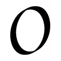 |
The upper-case letter 'O' has a smooth outline with no discontinuity or gap.
|