 |
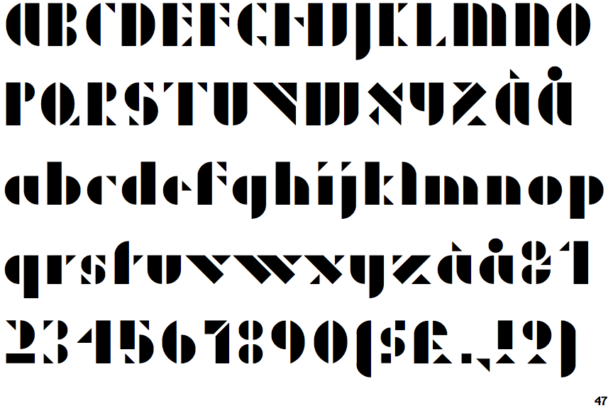
The upper-case 'J' descends below the baseline.
|
 |
The dot on the '?' (question-mark) is diamond-shaped or triangular.
|
 |
The verticals of the upper-case 'M' are parallel.
|
 |
The upper-case 'Y' right-hand arm forms a continuous stroke with the tail.
|
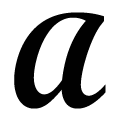 |
The upper-case 'A' is drawn like a lower-case 'a'.
|
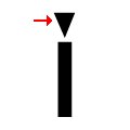 |
The dot on the lower-case 'i' or 'j' is triangular.
|
 |
The bar of the lower-case 'f' is single-sided.
|
 |
The bar of the '4' does not cross the vertical.
|
Note that the fonts in the icons shown above represent general examples, not necessarily the two fonts chosen for comparison.
Show Examples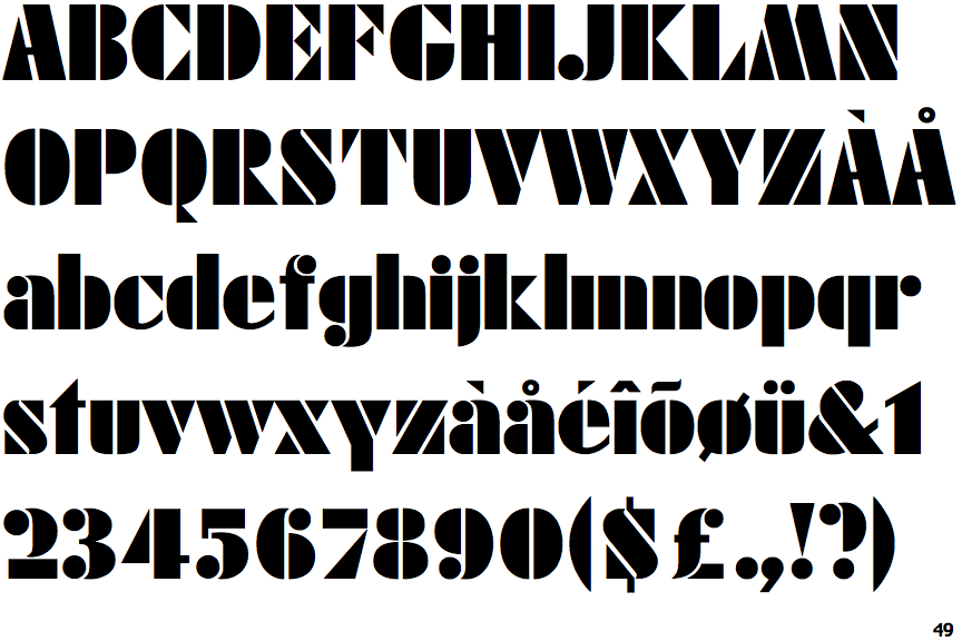
 |
The upper-case 'J' sits on the baseline.
|
 |
The dot on the '?' (question-mark) is circular or oval.
|
 |
The verticals of the upper-case 'M' are sloping.
|
 |
The upper-case 'Y' arms and tail are separate strokes.
|
 |
The upper-case 'A' has tapered verticals.
|
 |
The dot on the lower-case 'i' or 'j' is circular or oval.
|
 |
The bar of the lower-case 'f' is double-sided.
|
 |
The bar of the '4' crosses the vertical.
|