 |
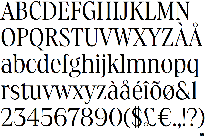
The upper-case 'Q' tail touches the circle.
|
 |
The diagonal strokes of the upper-case 'K' meet in a 'T'.
|
 |
The centre vertex of the upper-case 'M' is on the baseline.
|
 |
The top of the upper-case 'A' has no serifs or cusps.
|
 |
The top vertices of the upper-case 'M' have symmetrical single-sided serifs.
|
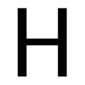 |
The bar of the upper-case 'H' is vertically central.
|
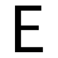 |
The centre bar of the upper-case 'E' is vertically central.
|
Note that the fonts in the icons shown above represent general examples, not necessarily the two fonts chosen for comparison.
Show Examples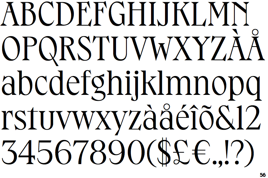
 |
The upper-case 'Q' tail crosses the circle.
|
 |
The diagonal strokes of the upper-case 'K' connect to the vertical via a horizontal bar.
|
 |
The centre vertex of the upper-case 'M' is above the baseline.
|
 |
The top of the upper-case 'A' has serifs both sides, or a top bar.
|
 |
The top vertices of the upper-case 'M' have symmetrical double-sided serifs.
|
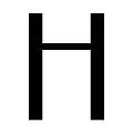 |
The bar of the upper-case 'H' is above centre.
|
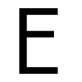 |
The centre bar of the upper-case 'E' is above centre.
|