 |
The verticals of the upper-case 'M' are sloping.
|
 |
The leg of the upper-case 'R' is straight.
|
 |
The tail of the upper-case 'Q' is straight (horizontal, diagonal, or vertical).
|
 |
The tail of the lower-case 'y' is substantially straight.
|
 |
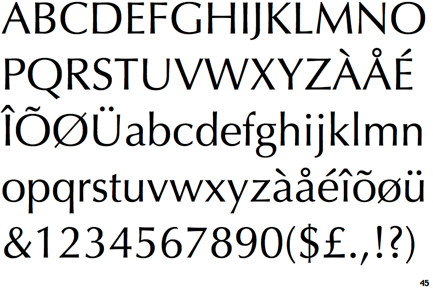
The straight strokes vary in thickness (stressed strokes).
|
Note that the fonts in the icons shown above represent general examples, not necessarily the two fonts chosen for comparison.
Show Examples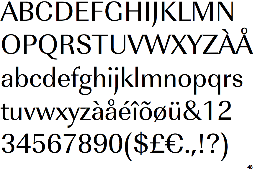
 |
The verticals of the upper-case 'M' are parallel.
|
 |
The leg of the upper-case 'R' is curved outwards.
|
 |
The tail of the upper-case 'Q' is curved, S-shaped, or Z-shaped.
|
 |
The tail of the lower-case 'y' is curved or U-shaped to the left.
|
 |
The straight strokes are constant thickness (unstressed).
|