 |
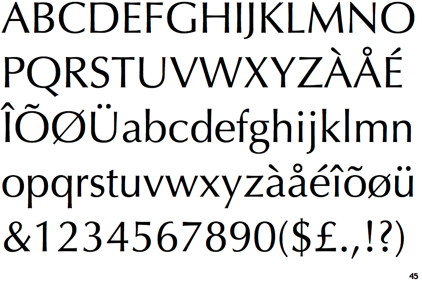
The '&' (ampersand) is traditional style with two enclosed loops.
|
 |
The upper-case 'J' descends below the baseline.
|
 |
The dot on the '?' (question-mark) is circular or oval.
|
 |
The top storey of the '3' is a smooth curve.
|
 |
The upper-case 'U' has no stem/serif.
|
 |
The top of the lower-case 'q' has a vertical or slightly angled spur (pointed or flat).
|
 |
The centre strokes of the lower-case 'w' meet at a vertex.
|
 |
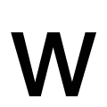
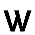
The centre strokes of the upper-case 'W' meet at a vertex.
|
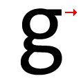 |
The spur of the lower-case 'g' is horizontal.
|
Note that the fonts in the icons shown above represent general examples, not necessarily the two fonts chosen for comparison.
Show Examples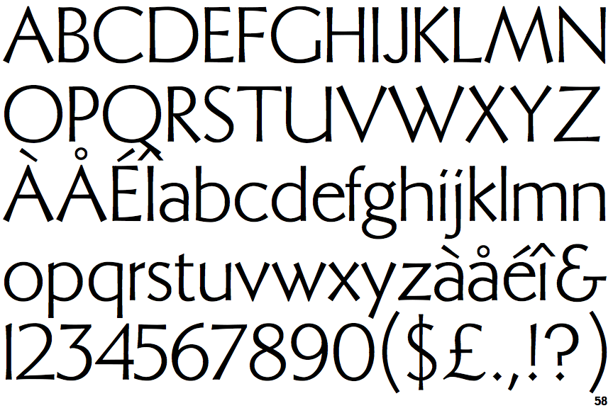
 |
The '&' (ampersand) looks like 'Et' with a gap at the top.
|
 |
The upper-case 'J' sits on the baseline.
|
 |
The dot on the '?' (question-mark) is diamond-shaped or triangular.
|
 |
The top storey of the '3' is a sharp angle.
|
 |
The upper-case 'U' has a stem/serif.
|
 |
The top of the lower-case 'q' has no spur or serif.
|
 |
The centre strokes of the lower-case 'w' meet in a T on the left.
|
 |
The centre strokes of the upper-case 'W' meet in a T on the left.
|
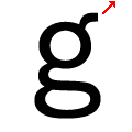 |
The spur of the lower-case 'g' is slanted.
|