Identifont

Fonts by Appearance

Fonts by Name

Fonts by Similarity

Fonts by Picture

Fonts by Designer/Publisher

Differences

TweetTweet Differences

Compare: and  

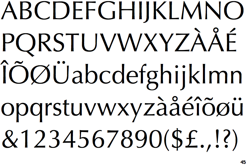
Optima

Optima

Below
The upper-case 'J' descends below the baseline.
Round
The top storey of the '3' is a smooth curve.

Note that the fonts in the icons shown above represent general examples, not necessarily the two fonts chosen for comparison.

Show Examples
Signata

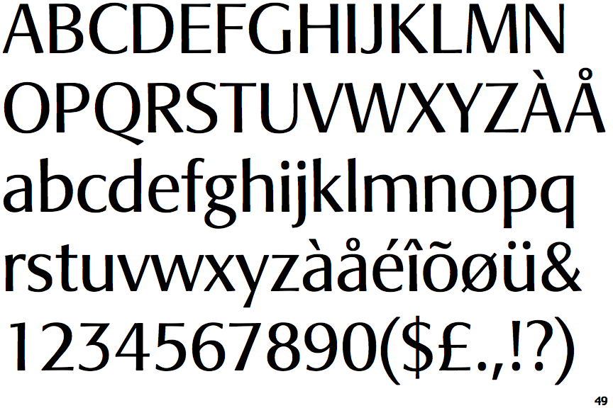
Signata

On
The upper-case 'J' sits on the baseline.
Angled
The top storey of the '3' is a sharp angle.