Identifont

Fonts by Appearance

Fonts by Name

Fonts by Similarity

Fonts by Picture

Fonts by Designer/Publisher

Differences

TweetTweet Differences

Compare: and  

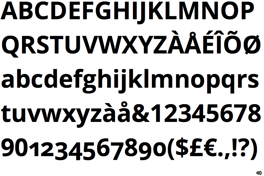
Open Sans Bold

Open Sans Bold

Below
The upper-case 'J' descends below the baseline.
Double
The diagonal strokes of the upper-case 'K' meet in a 'T'.
Plain
The upper-case 'J' has no bar.
Straight
The leg of the upper-case 'R' is straight.
Circle
The dot on the lower-case 'i' or 'j' is circular or oval.

Note that the fonts in the icons shown above represent general examples, not necessarily the two fonts chosen for comparison.

Show Examples
Distefano Sans Black

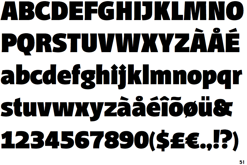
Distefano Sans Black

On
The upper-case 'J' sits on the baseline.
Single
The diagonal strokes of the upper-case 'K' meet at the vertical (with or without a gap).
Single-bar
The upper-case 'J' has a bar to the left.
Outwards
The leg of the upper-case 'R' is curved outwards.
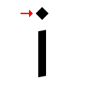
Diamond
The dot on the lower-case 'i' or 'j' is diamond-shaped.