 |
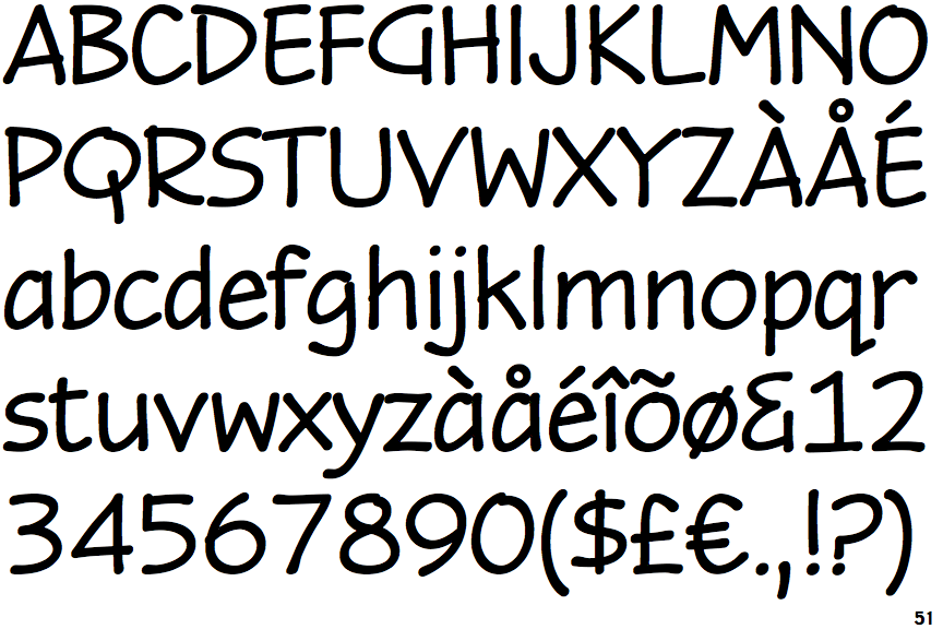
The '&' (ampersand) looks like 'Et' with a gap at the top.
|
 |
The centre vertex of the upper-case 'M' is above the baseline.
|
 |
The upper-case 'G' has a spur/tail.
|
 |
The upper-case 'G' has no bar.
|
 |
The upper-case 'Y' arms and tail are separate strokes.
|
 |
The upper-case 'J' has no bar.
|
 |
The upper-case letter 'I' is plain.
|
 |
The tail of the lower-case 'y' curves or points to the left without a loop.
|
Note that the fonts in the icons shown above represent general examples, not necessarily the two fonts chosen for comparison.
Show Examples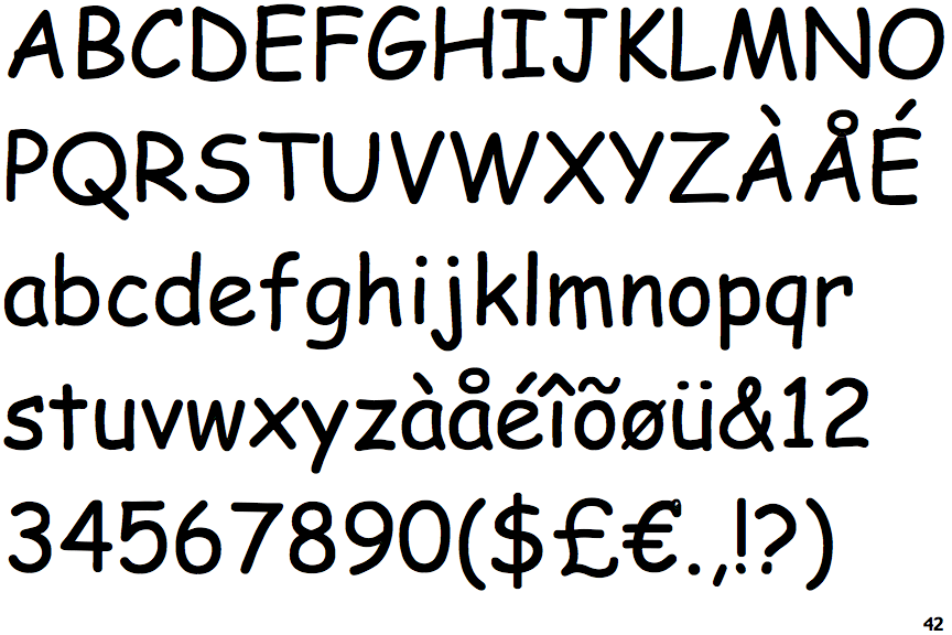
 |
The '&' (ampersand) is traditional style with two enclosed loops.
|
 |
The centre vertex of the upper-case 'M' is on the baseline.
|
|
The upper-case 'G' has no spur/tail.
|
 |
The upper-case 'G' has a bar to the left.
|
 |
The upper-case 'Y' right-hand arm forms a continuous stroke with the tail.
|
 |
The upper-case 'J' has a bar both sides.
|
 |
The upper-case letter 'I' has serifs/bars.
|
 |
The tail of the lower-case 'y' is substantially straight.
|