 |
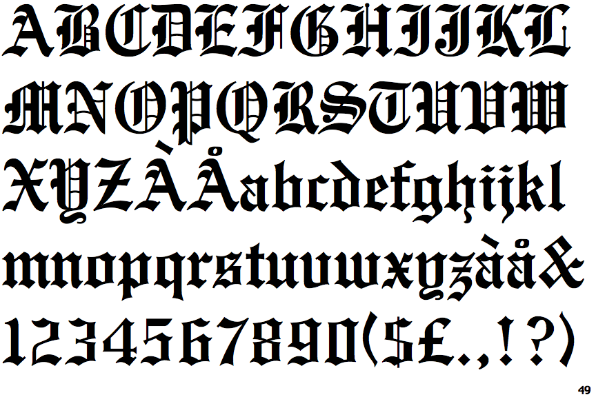
The upper-case 'Q' tail touches the circle.
|
 |
The '$' (dollar) has a single line crossing the 'S'.
|
 |
The upper-case 'J' sits on the baseline.
|
 |
The dot on the '?' (question-mark) is diamond-shaped or triangular.
|
 |
The characters are solid.
|
 |
The lower-case 'a' stem curves over the top of the bowl (double storey).
|
 |
The top of the upper-case 'A' has a serif or cusp on the left.
|
 |
The top stroke of the upper-case 'C' has no upward-pointing serif.
|
 |
The upper-case 'E' is normal letter shape.
|
 |
The strokes are upright.
|
There are more than ten differences; only the first ten are shown.
Note that the fonts in the icons shown above represent general examples, not necessarily the two fonts chosen for comparison.
Show Examples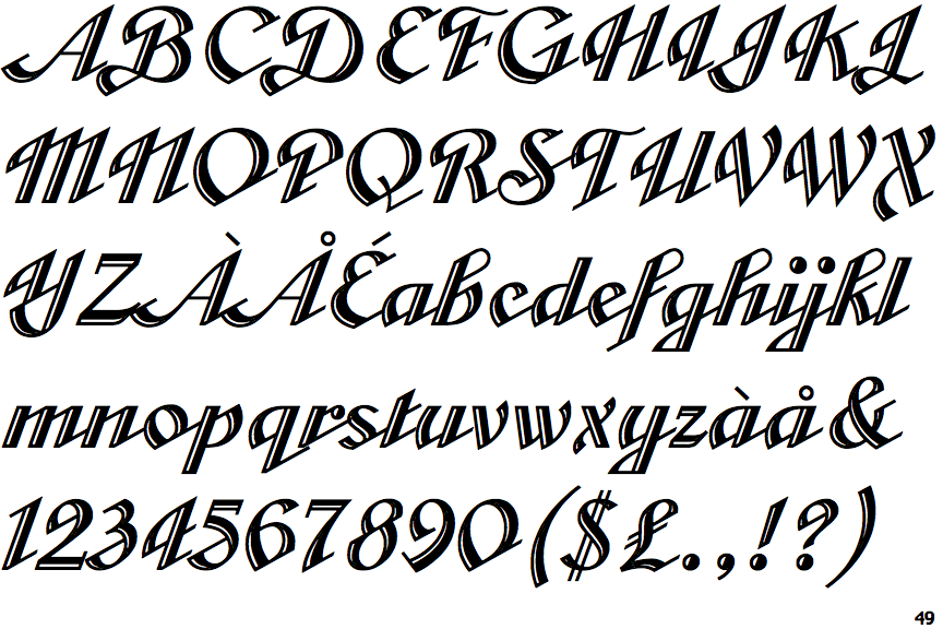
 |
The upper-case 'Q' tail crosses the circle.
|
 |
The '$' (dollar) has a double line crossing the 'S'.
|
 |
The upper-case 'J' descends below the baseline.
|
 |
The dot on the '?' (question-mark) is circular or oval.
|
 |
The characters are outlined, shaded, or filled with a pattern.
|
 |
The lower-case 'a' stem stops at the top of the bowl (single storey).
|
 |
The top of the upper-case 'A' has no serifs or cusps.
|
 |
The top stroke of the upper-case 'C' has a vertical or angled upward-pointing serif.
|
 |
The upper-case 'E' is drawn as a single stroke (with or without loop).
|
 |
The strokes are sloped right (italic, oblique, or cursive).
|