 |
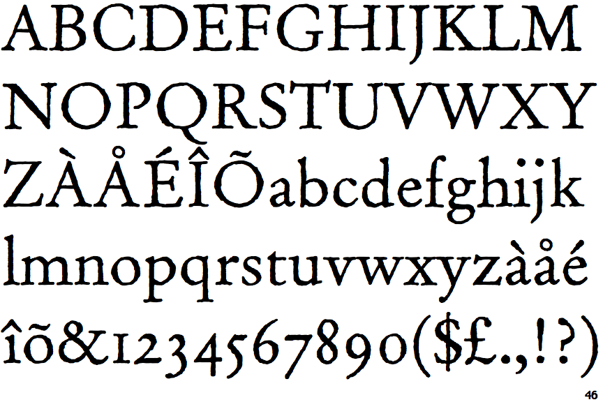
The upper-case 'Q' tail touches the circle.
|
 |
The '$' (dollar) has a single line crossing the 'S'.
|
 |
The upper-case 'J' descends below the baseline.
|
 |
The characters have serifs.
|
 |
The '4' is closed.
|
 |
The centre bar of the upper-case 'P' leaves a gap with the vertical.
|
 |
The lower-case 'g' is double-storey (with or without gap).
|
 |
The bar of the lower-case 'f' is double-sided.
|
 |
The '7' has a bar.
|
 |
The character outlines are corroded, roughened, or dirty.
|
Note that the fonts in the icons shown above represent general examples, not necessarily the two fonts chosen for comparison.
Show Examples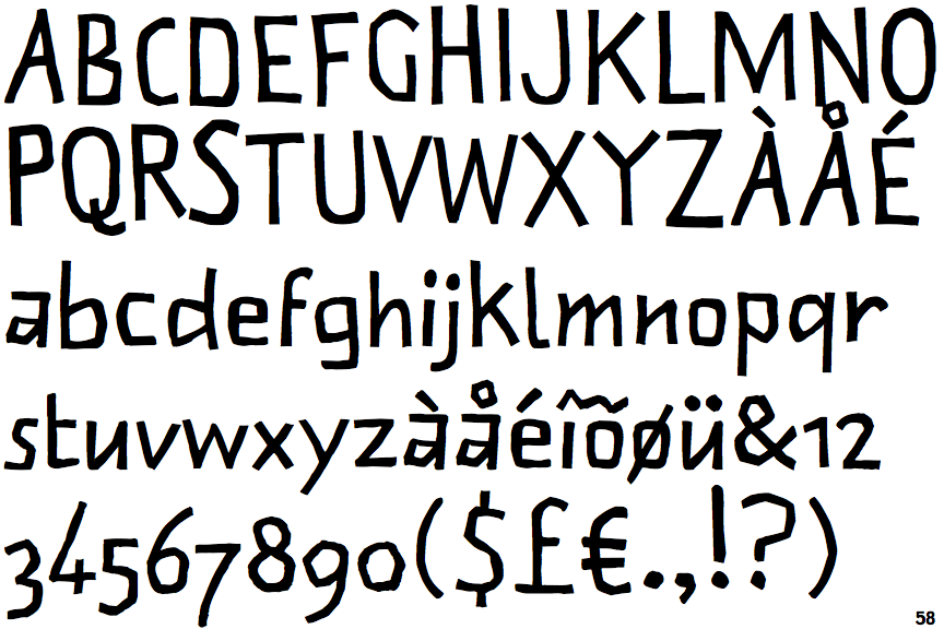
 |
The upper-case 'Q' tail crosses the circle.
|
 |
The '$' (dollar) has a single line which does not cross the 'S'.
|
 |
The upper-case 'J' sits on the baseline.
|
 |
The characters do not have serifs.
|
 |
The '4' is open.
|
 |
The centre bar of the upper-case 'P' meets the vertical.
|
 |
The lower-case 'g' is single-storey (with or without loop).
|
 |
The bar of the lower-case 'f' is single-sided.
|
 |
The '7' has no bar.
|
 |
The character outlines are smooth/sharp.
|