Identifont

Fonts by Appearance

Fonts by Name

Fonts by Similarity

Fonts by Picture

Fonts by Designer/Publisher

Differences

TweetTweet Differences

Compare: and  

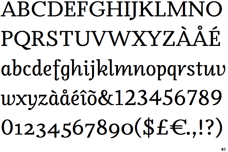
Odile Upright Italic

Odile Upright Italic

Closed
The '&' (ampersand) is traditional style with two enclosed loops.
Top serif
The top stroke of the upper-case 'C' has a vertical or angled upward-pointing serif.
Curved
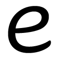
The lower-case 'e' has a curved bar with no straight segment.

Note that the fonts in the icons shown above represent general examples, not necessarily the two fonts chosen for comparison.

Show Examples
Nara Cursive

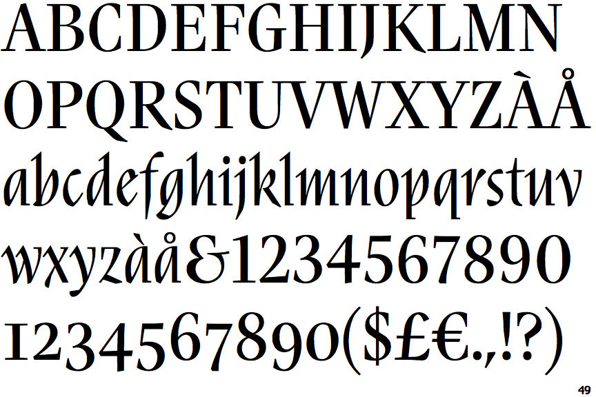
Nara Cursive

Gap top
The '&' (ampersand) looks like 'Et' with a gap at the top.
No top serif
The top stroke of the upper-case 'C' has no upward-pointing serif.
Sloping
The lower-case 'e' has a straight angled bar.