Identifont

Fonts by Appearance

Fonts by Name

Fonts by Similarity

Fonts by Picture

Fonts by Designer/Publisher

Differences

TweetTweet Differences

Compare: and  

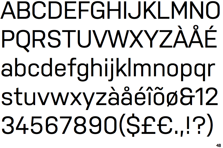
Nudista

Nudista

Et shaped
The '&' (ampersand) looks like 'Et' with one enclosed loop (with or without exit stroke).
Open
The '4' is open.
Double
The diagonal strokes of the upper-case 'K' meet in a 'T'.
Above
The centre vertex of the upper-case 'M' is above the baseline.
Spur
The upper-case 'G' has a spur/tail.

Note that the fonts in the icons shown above represent general examples, not necessarily the two fonts chosen for comparison.

Show Examples
GT Pressura

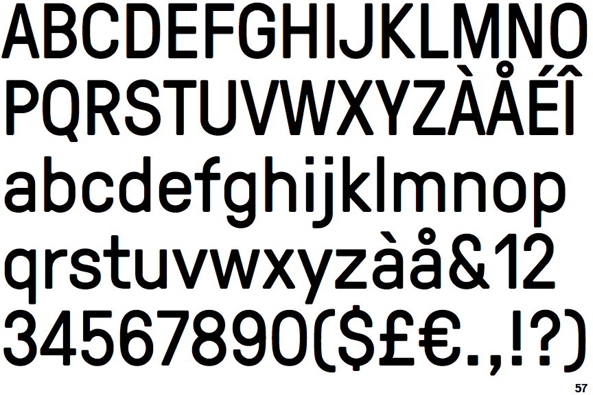
GT Pressura

Open
The '&' (ampersand) is traditional style with a gap at the top.
Closed
The '4' is closed.
Single
The diagonal strokes of the upper-case 'K' meet at the vertical (with or without a gap).
Baseline
The centre vertex of the upper-case 'M' is on the baseline.
No spur
The upper-case 'G' has no spur/tail.