 |
The upper-case 'J' descends below the baseline.
|
 |
The '4' is closed.
|
 |
The top of the upper-case 'A' has a serif or cusp on the left.
|
 |
The top stroke of the upper-case 'C' has no upward-pointing serif.
|
 |
The upper-case 'G' foot has a downward pointing spur.
|
 |
The top of the lower-case 'q' has a vertical or slightly angled spur (pointed or flat).
|
 |
The tail of the upper-case 'J' has a tapered end.
|
 |
The upper-case 'C' is symmetrical about a horizontal axis.
|
 |
The tail of the lower-case 'f' sits on the baseline.
|
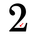 |
The base of the '2' is straight.
|
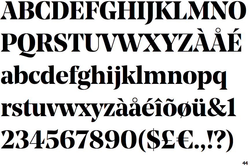
Note that the fonts in the icons shown above represent general examples, not necessarily the two fonts chosen for comparison.
Show Examples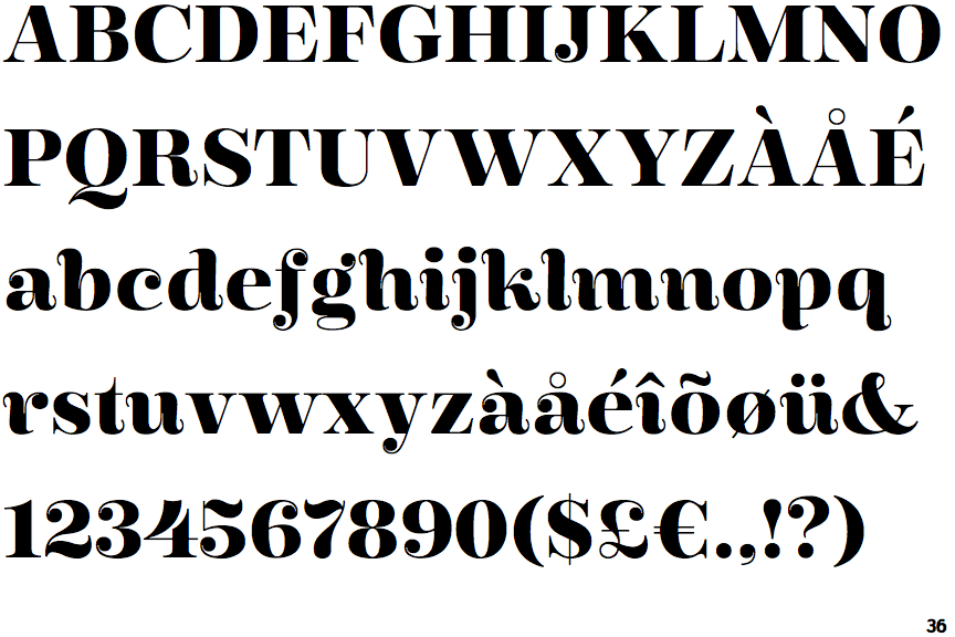
 |
The upper-case 'J' sits on the baseline.
|
 |
The '4' is open.
|
 |
The top of the upper-case 'A' has no serifs or cusps.
|
 |
The top stroke of the upper-case 'C' has a vertical or angled upward-pointing serif.
|
 |
The upper-case 'G' foot has no spur or serif.
|
 |
The top of the lower-case 'q' has no spur or serif.
|
 |
The tail of the upper-case 'J' has a rounded end or ball.
|
 |
The upper-case 'C' is asymmetrical about a horizontal axis.
|
 |
The tail of the lower-case 'f' descends below the baseline.
|
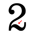 |
The base of the '2' is curved.
|