Differences
Noa
 |
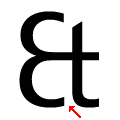
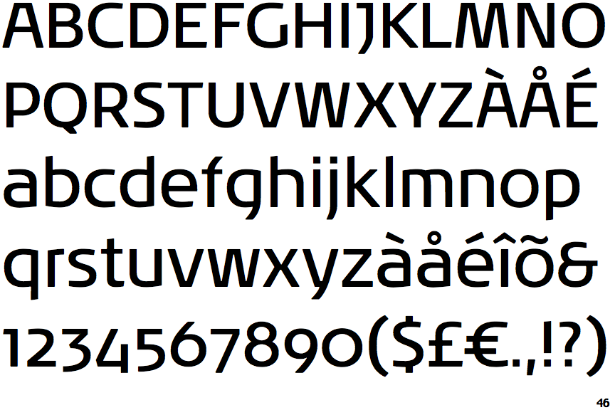
The '&' (ampersand) looks like 'Et' with one enclosed loop (with or without exit stroke).
|
 |
The '4' is open.
|
 |
The centre vertex of the upper-case 'M' is on the baseline.
|
 |
The top storey of the '3' is a sharp angle.
|
 |
The lower-case 'g' is single-storey (with or without loop).
|
 |
The upper-case 'G' has no bar.
|
 |
The 'l' (lower-case 'L') has no serifs or tail.
|
 |
The upper-case 'J' has a bar to the left.
|
 |
The leg of the upper-case 'R' is straight.
|
 |
The tail of the upper-case 'Q' is straight (horizontal, diagonal, or vertical).
|
There are more than ten differences; only the first ten are shown.
Note that the fonts in the icons shown above represent general examples, not necessarily the two fonts chosen for comparison.
Show ExamplesFF Max Extra Light
 |
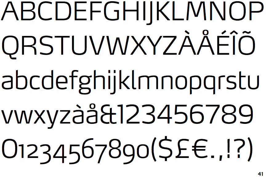
The '&' (ampersand) looks like 'Et' with a gap at the bottom (with or without exit stroke).
|
 |
The '4' is closed.
|
 |
The centre vertex of the upper-case 'M' is above the baseline.
|
 |
The top storey of the '3' is a smooth curve.
|
 |
The lower-case 'g' is double-storey (with or without gap).
|
 |
The upper-case 'G' has a bar to the left.
|
 |
The 'l' (lower-case 'L') has a right-facing lower serif or tail.
|
 |
The upper-case 'J' has no bar.
|
 |
The leg of the upper-case 'R' is curved outwards.
|
 |
The tail of the upper-case 'Q' is curved, S-shaped, or Z-shaped.
|

