 |
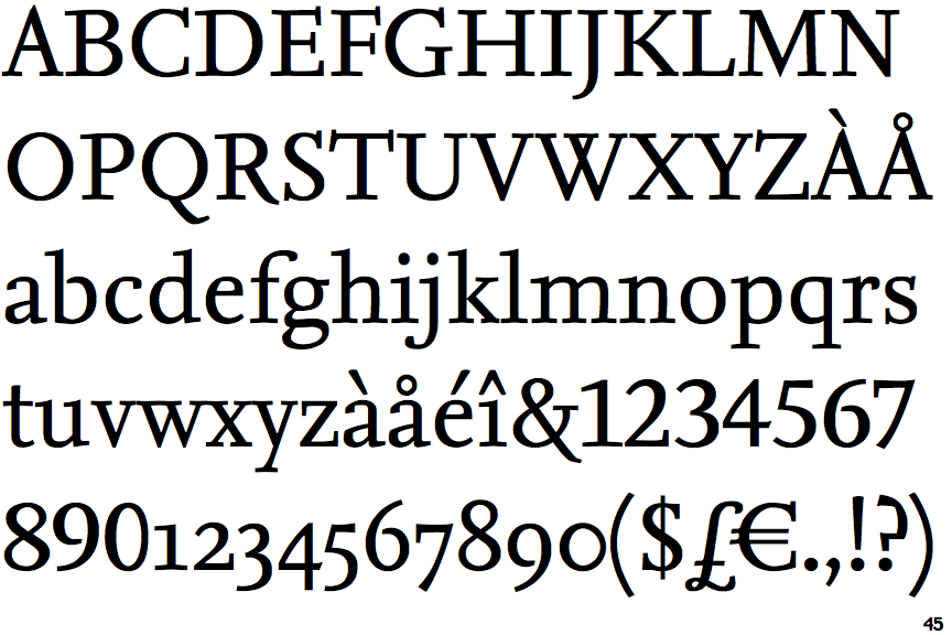
The '$' (dollar) has a single line crossing the 'S'.
|
 |
The upper-case 'J' descends below the baseline.
|
 |
The top of the upper-case 'A' has no serifs or cusps.
|
 |
The top stroke of the upper-case 'C' has a vertical or angled upward-pointing serif.
|
 |
The top of the lower-case 'q' has no spur or serif.
|
 |
The top of the upper-case 'W' has four upper terminals.
|
 |
The foot of the '4' has no serifs.
|
 |
The feet of the lower-case 'h' have two serifs on each foot.
|
 |
The lower storey of the lower-case 'g' has no gap.
|
 |
The feet of the lower-case 'm' have two serifs on each foot.
|
There are more than ten differences; only the first ten are shown.
Note that the fonts in the icons shown above represent general examples, not necessarily the two fonts chosen for comparison.
Show Examples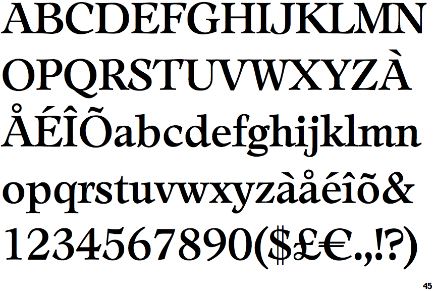
 |
The '$' (dollar) has a double line crossing the 'S'.
|
 |
The upper-case 'J' sits on the baseline.
|
 |
The top of the upper-case 'A' has a serif or cusp on the left.
|
 |
The top stroke of the upper-case 'C' has no upward-pointing serif.
|
 |
The top of the lower-case 'q' has a vertical or slightly angled spur (pointed or flat).
|
 |
The top of the upper-case 'W' has three upper terminals.
|
 |
The foot of the '4' has double-sided serifs.
|
 |
The feet of the lower-case 'h' have two serifs on the left and one on the right.
|
 |
The lower storey of the lower-case 'g' has a gap.
|
 |
The feet of the lower-case 'm' have two serifs on the left, and one on the centre and right.
|