 |
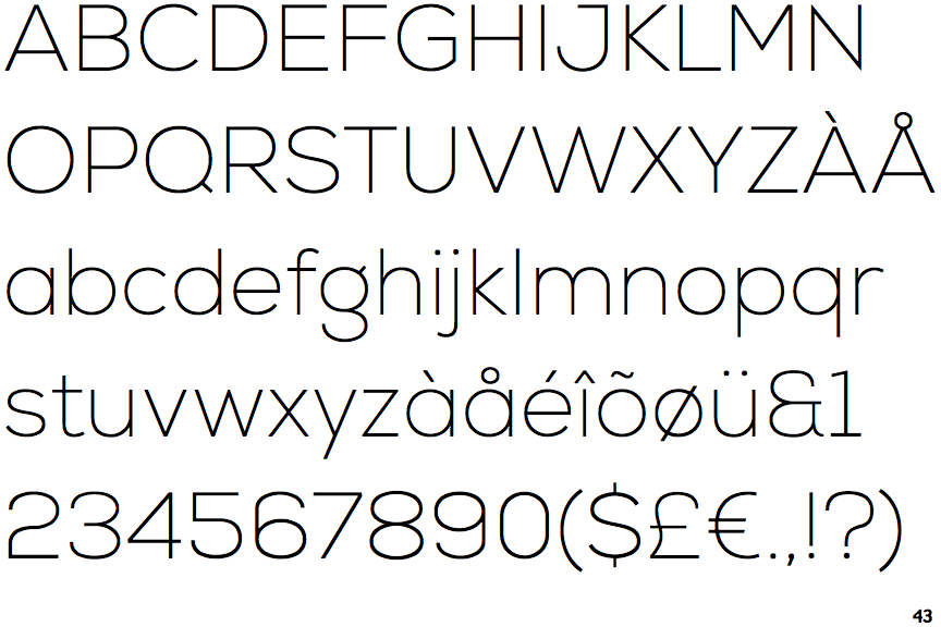
The '$' (dollar) has a single line which does not cross the 'S'.
|
 |
The '&' (ampersand) looks like 'Et' with one enclosed loop (with or without exit stroke).
|
 |
The verticals of the upper-case 'M' are parallel.
|
 |
The lower-case 'a' stem stops at the top of the bowl (single storey).
|
 |
The upper-case 'J' has a bar to the left.
|
 |
The leg of the upper-case 'R' is straight.
|
 |
The sides of the lower-case 'y' are angled (V-shaped).
|
 |
The top of the upper-case 'W' has three upper terminals.
|
Note that the fonts in the icons shown above represent general examples, not necessarily the two fonts chosen for comparison.
Show Examples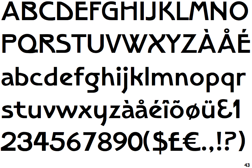
 |
The '$' (dollar) has a single line crossing the 'S'.
|
 |
The '&' (ampersand) looks like 'Et' with a gap at the top.
|
 |
The verticals of the upper-case 'M' are sloping.
|
 |
The lower-case 'a' stem curves over the top of the bowl (double storey).
|
 |
The upper-case 'J' has no bar.
|
 |
The leg of the upper-case 'R' is curved outwards.
|
 |
The sides of the lower-case 'y' are parallel (U-shaped).
|
 |
The top of the upper-case 'W' has four upper terminals.
|