Identifont

Fonts by Appearance

Fonts by Name

Fonts by Similarity

Fonts by Picture

Fonts by Designer/Publisher

Differences

TweetTweet Differences

Compare: and  

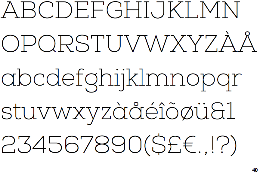
Nexa Slab Thin

Nexa Slab Thin

Serif
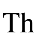
The characters have serifs.
Double
The diagonal strokes of the upper-case 'K' meet in a 'T'.
Angled
The top storey of the '3' is a sharp angle.

Note that the fonts in the icons shown above represent general examples, not necessarily the two fonts chosen for comparison.

Show Examples
Nexa Thin

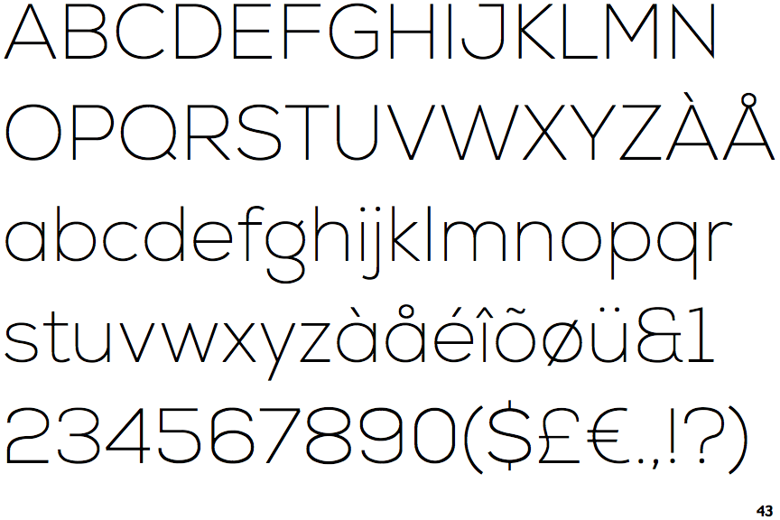
Nexa Thin

Sans-serif
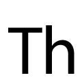
The characters do not have serifs.
Single
The diagonal strokes of the upper-case 'K' meet at the vertical (with or without a gap).
Round
The top storey of the '3' is a smooth curve.