 |
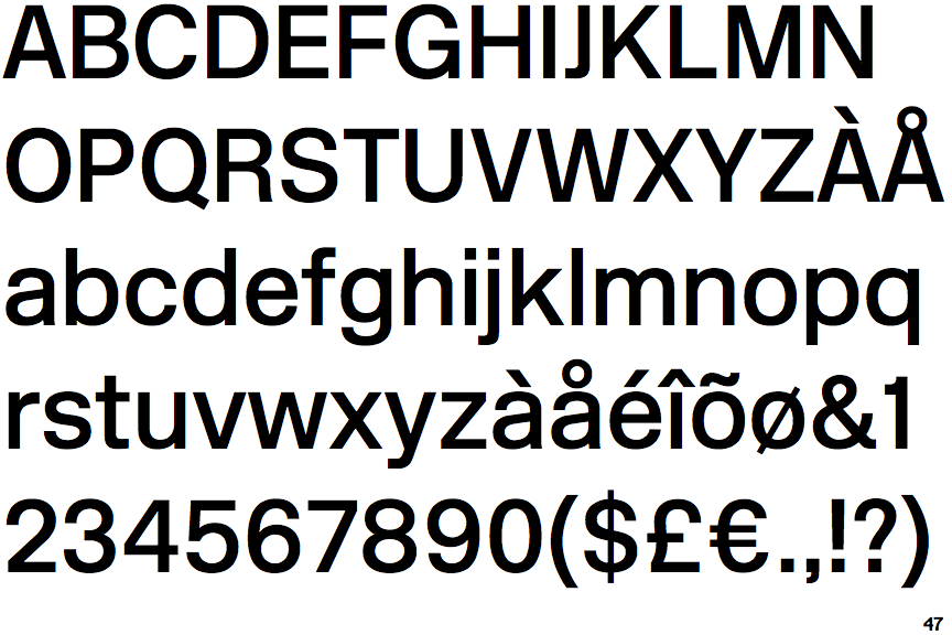
The leg of the upper-case 'R' is curved outwards.
|
 |
The stem of the '7' is straight.
|
 |
The foot of the '£' (pound) has no loop.
|
Note that the fonts in the icons shown above represent general examples, not necessarily the two fonts chosen for comparison.
Show Examples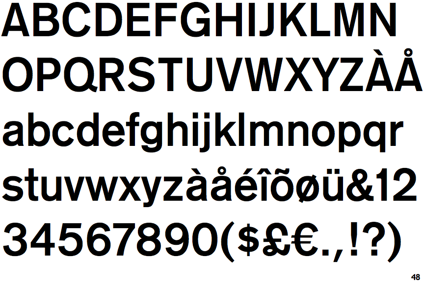
 |
The leg of the upper-case 'R' is straight.
|
 |
The stem of the '7' is curved inwards.
|
 |
The foot of the '£' (pound) has a loop.
|