 |
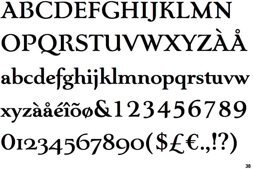
The upper-case 'J' descends below the baseline.
|
 |
The characters have serifs.
|
 |
The centre vertex of the upper-case 'M' is on the baseline.
|
 |
The verticals of the upper-case 'M' are sloping.
|
 |
The centre bar of the upper-case 'P' leaves a gap with the vertical.
|
 |
The upper-case 'U' has a stem/serif.
|
 |
The centre bar of the upper-case 'R' leaves a gap with the vertical.
|
 |
The sides of the lower-case 'y' are angled (V-shaped).
|
 |
The lower-case 'e' has a straight angled bar.
|
 |
The tail of the lower-case 'f' descends below the baseline.
|
Note that the fonts in the icons shown above represent general examples, not necessarily the two fonts chosen for comparison.
Show Examples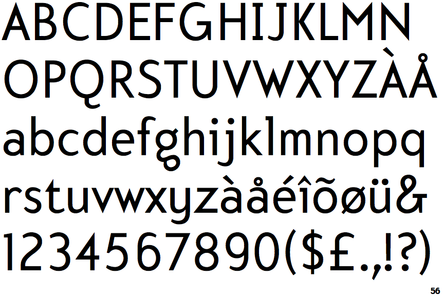
 |
The upper-case 'J' sits on the baseline.
|
 |
The characters do not have serifs.
|
 |
The centre vertex of the upper-case 'M' is above the baseline.
|
|
The verticals of the upper-case 'M' are parallel.
|
 |
The centre bar of the upper-case 'P' meets the vertical.
|
 |
The upper-case 'U' has no stem/serif.
|
 |
The centre bar of the upper-case 'R' meets the vertical.
|
 |
The sides of the lower-case 'y' are parallel (U-shaped).
|
 |
The lower-case 'e' has a straight horizontal bar.
|
 |
The tail of the lower-case 'f' sits on the baseline.
|