 |
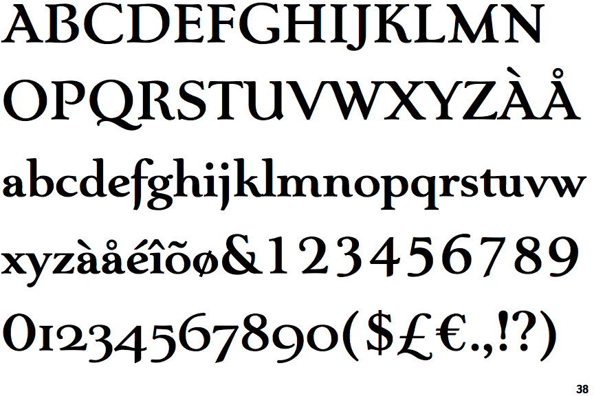
The upper-case 'Q' tail touches the circle.
|
 |
The upper-case 'U' has a stem/serif.
|
 |
The top of the upper-case 'A' has a serif or cusp on the left.
|
 |
The centre bar of the upper-case 'E' has serifs.
|
 |
The upper-case 'E' is normal letter shape.
|
 |
The foot of the '4' has no serifs.
|
 |
The bar of the upper-case 'G' is single-sided, left-facing.
|
 |
The lower-case 'e' has a straight angled bar.
|
 |
The feet of the lower-case 'h' have two serifs on the left and one on the right.
|
 |
The lower storey of the lower-case 'g' has no gap.
|
There are more than ten differences; only the first ten are shown.
Note that the fonts in the icons shown above represent general examples, not necessarily the two fonts chosen for comparison.
Show Examples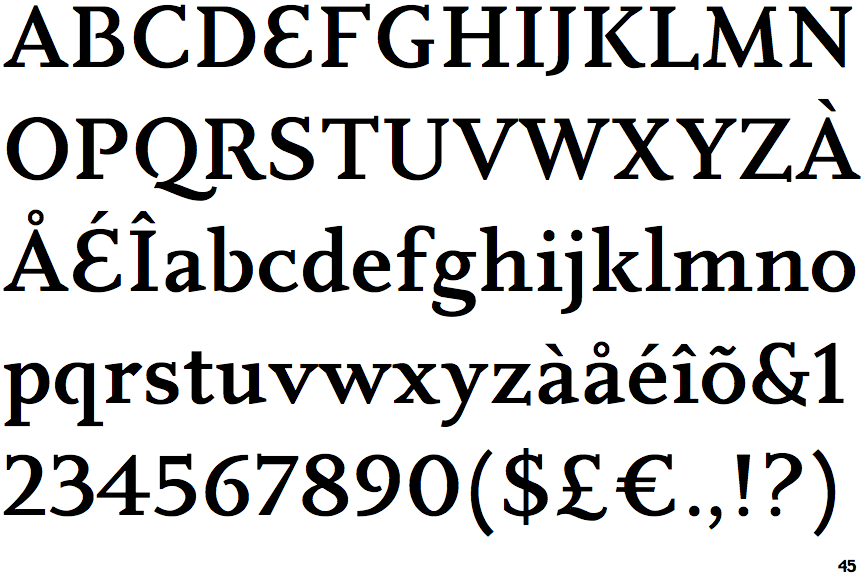
 |
The upper-case 'Q' tail forms part of the stroke of an open circle.
|
 |
The upper-case 'U' has no stem/serif.
|
 |
The top of the upper-case 'A' has no serifs or cusps.
|
 |
The centre bar of the upper-case 'E' has no serifs.
|
 |
The upper-case 'E' is drawn as a single stroke (with or without loop).
|
 |
The foot of the '4' has double-sided serifs.
|
 |
The bar of the upper-case 'G' is double-sided.
|
 |
The lower-case 'e' has a straight horizontal bar.
|
 |
The feet of the lower-case 'h' have two serifs on each foot.
|
 |
The lower storey of the lower-case 'g' has a gap.
|