 |
The upper-case 'J' sits on the baseline.
|
 |
The verticals of the upper-case 'M' are parallel.
|
 |
The top storey of the '3' is a sharp angle.
|
 |
The lower-case 'a' stem curves over the top of the bowl (double storey).
|
 |
The upper-case 'J' has a bar to the left.
|
 |
The lower-case 'u' has a stem/serif.
|
 |
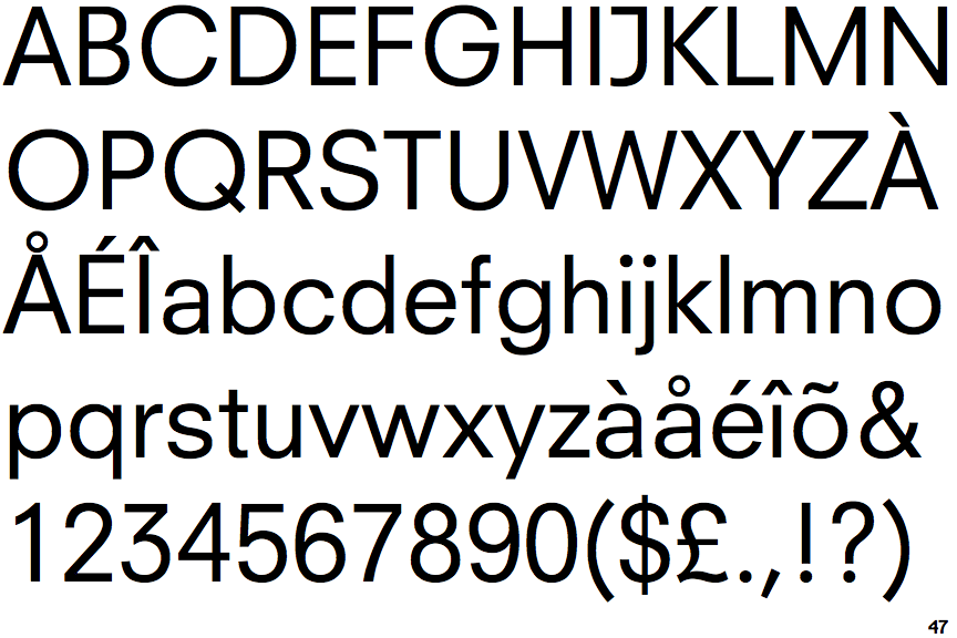
The lower-case 'i' or 'j' is the same height as the k and l.
|
 |
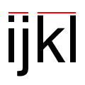
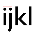
The ends of the upper-case 'Q' tail are both diagonal.
|
 |
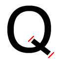
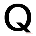
The leg of the upper-case 'R' is separated from the vertical by a distinct horizontal section.
|
 |
The tail of the lower-case 'j' is curved with no upper serif.
|
There are more than ten differences; only the first ten are shown.
Note that the fonts in the icons shown above represent general examples, not necessarily the two fonts chosen for comparison.
Show Examples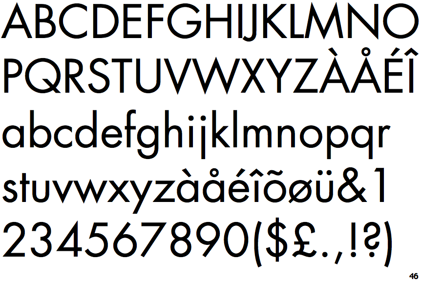
 |
The upper-case 'J' descends below the baseline.
|
 |
The verticals of the upper-case 'M' are sloping.
|
 |
The top storey of the '3' is a smooth curve.
|
 |
The lower-case 'a' stem stops at the top of the bowl (single storey).
|
 |
The upper-case 'J' has no bar.
|
 |
The lower-case 'u' has no stem/serif.
|
 |
The lower-case 'i' or 'j' is lower than the k and l.
|
 |
The ends of the upper-case 'Q' tail are both horizontal.
|
 |
The leg of the upper-case 'R' meets the vertical.
|
 |
The tail of the lower-case 'j' is straight with no upper serif.
|