 |
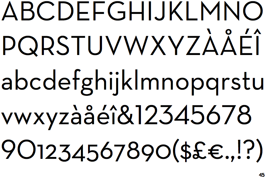
The upper-case 'J' sits on the baseline.
|
 |
The '4' is closed.
|
 |
The diagonal strokes of the upper-case 'K' meet in a 'T'.
|
 |
The top storey of the '3' is a sharp angle.
|
 |
The upper-case 'G' has no spur/tail.
|
 |
The upper-case 'J' has no bar.
|
 |
The lower-case 'u' has no stem/serif.
|
 |
The upper-case letter 'I' is plain.
|
Note that the fonts in the icons shown above represent general examples, not necessarily the two fonts chosen for comparison.
Show Examples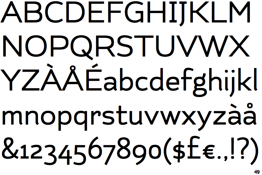
 |
The upper-case 'J' descends below the baseline.
|
 |
The '4' is open.
|
 |
The diagonal strokes of the upper-case 'K' connect to the vertical via a horizontal bar.
|
 |
The top storey of the '3' is a smooth curve.
|
 |
The upper-case 'G' has a spur/tail.
|
 |
The upper-case 'J' has a bar both sides.
|
 |
The lower-case 'u' has a stem/serif.
|
 |
The upper-case letter 'I' has serifs/bars.
|