 |
The upper-case 'Q' tail crosses the circle.
|
 |
The '4' is closed.
|
 |
The verticals of the upper-case 'M' are parallel.
|
 |
The top storey of the '3' is a sharp angle.
|
 |
The lower-case 'g' is double-storey (with or without gap).
|
 |
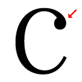
The top stroke of the upper-case 'C' has a vertical or angled upward-pointing serif.
|
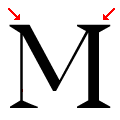 |
The top vertices of the upper-case 'M' have one serif on the left, two on the right.
|
Note that the fonts in the icons shown above represent general examples, not necessarily the two fonts chosen for comparison.
Show Examples
 |
The upper-case 'Q' tail touches the circle.
|
 |
The '4' is open.
|
 |
The verticals of the upper-case 'M' are sloping.
|
 |
The top storey of the '3' is a smooth curve.
|
 |
The lower-case 'g' is single-storey (with or without loop).
|
 |
The top stroke of the upper-case 'C' has a ball.
|
 |
The top vertices of the upper-case 'M' have symmetrical single-sided serifs.
|