 |
The upper-case 'Q' tail touches the circle.
|
 |
The centre vertex of the upper-case 'M' is on the baseline.
|
 |
The dot on the '?' (question-mark) is diamond-shaped or triangular.
|
 |
The verticals of the upper-case 'M' are sloping.
|
 |
The upper-case 'U' has a stem/serif.
|
 |
The upper-case 'G' has no bar.
|
 |
The upper-case 'Y' right-hand arm forms a continuous stroke with the tail.
|
 |
The centre strokes of the upper-case 'W' meet at a vertex.
|
 |
The straight strokes vary in thickness (stressed strokes).
|
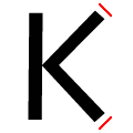 |
The ends of the upper-case 'K' strokes are both angled.
|
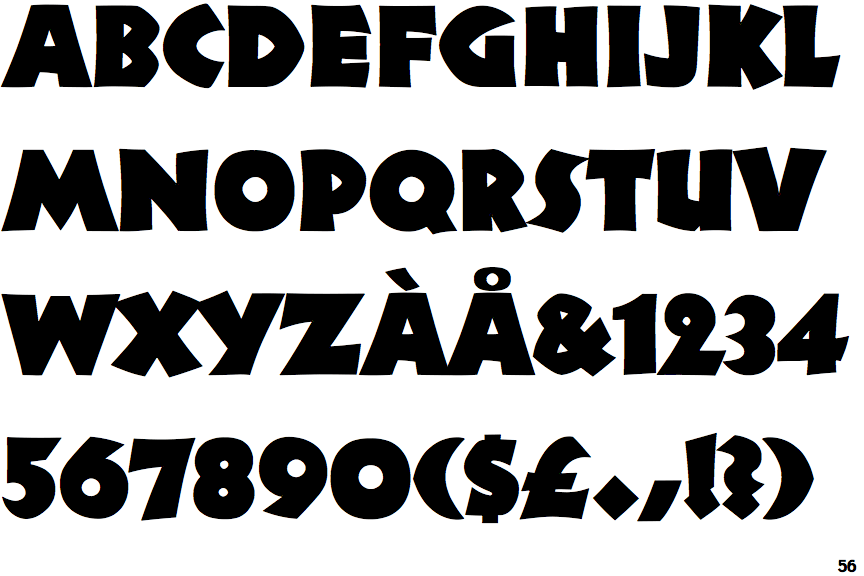
Note that the fonts in the icons shown above represent general examples, not necessarily the two fonts chosen for comparison.
Show Examples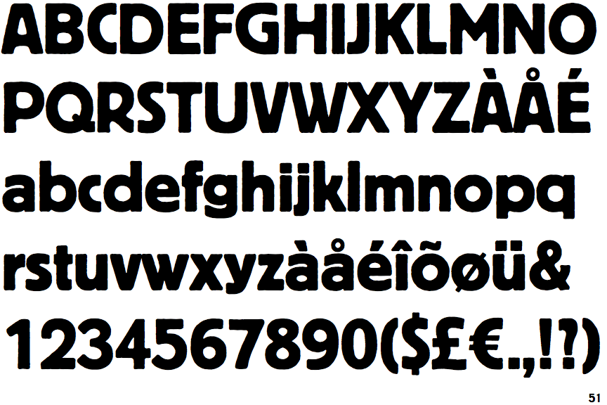
 |
The upper-case 'Q' tail crosses the circle.
|
 |
The centre vertex of the upper-case 'M' is above the baseline.
|
 |
The dot on the '?' (question-mark) is square or rectangular.
|
|
The verticals of the upper-case 'M' are parallel.
|
 |
The upper-case 'U' has no stem/serif.
|
 |
The upper-case 'G' has a bar to the left.
|
 |
The upper-case 'Y' arms and tail are separate strokes.
|
 |
The centre strokes of the upper-case 'W' meet in a T on the left.
|
 |
The straight strokes are constant thickness (unstressed).
|
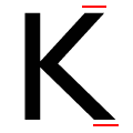 |
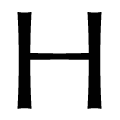
The ends of the upper-case 'K' strokes are both horizontal.
|