Identifont

Fonts by Appearance

Fonts by Name

Fonts by Similarity

Fonts by Picture

Fonts by Designer/Publisher

Differences

TweetTweet Differences

Compare: and  

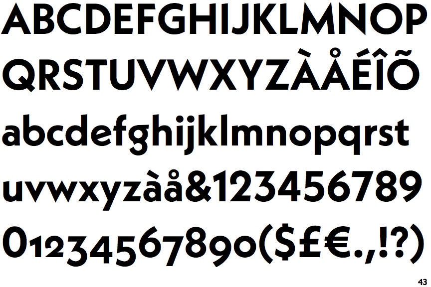
Neue Kabel Bold

Neue Kabel Bold

Crosses
The upper-case 'Q' tail crosses the circle.
Baseline
The centre vertex of the upper-case 'M' is on the baseline.
Angled
The top storey of the '3' is a sharp angle.
Sloping
The lower-case 'e' has a straight angled bar.
On
The tail of the lower-case 'f' sits on the baseline.

Note that the fonts in the icons shown above represent general examples, not necessarily the two fonts chosen for comparison.

Show Examples
Metro Gothic (BA)

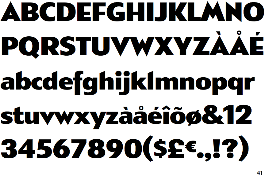
Metro Gothic (BA)

Touches
The upper-case 'Q' tail touches the circle.
Above
The centre vertex of the upper-case 'M' is above the baseline.
Round
The top storey of the '3' is a smooth curve.
Horizontal
The lower-case 'e' has a straight horizontal bar.
Below
The tail of the lower-case 'f' descends below the baseline.