Identifont

Fonts by Appearance

Fonts by Name

Fonts by Similarity

Fonts by Picture

Fonts by Designer/Publisher

Differences

TweetTweet Differences

Compare: and  

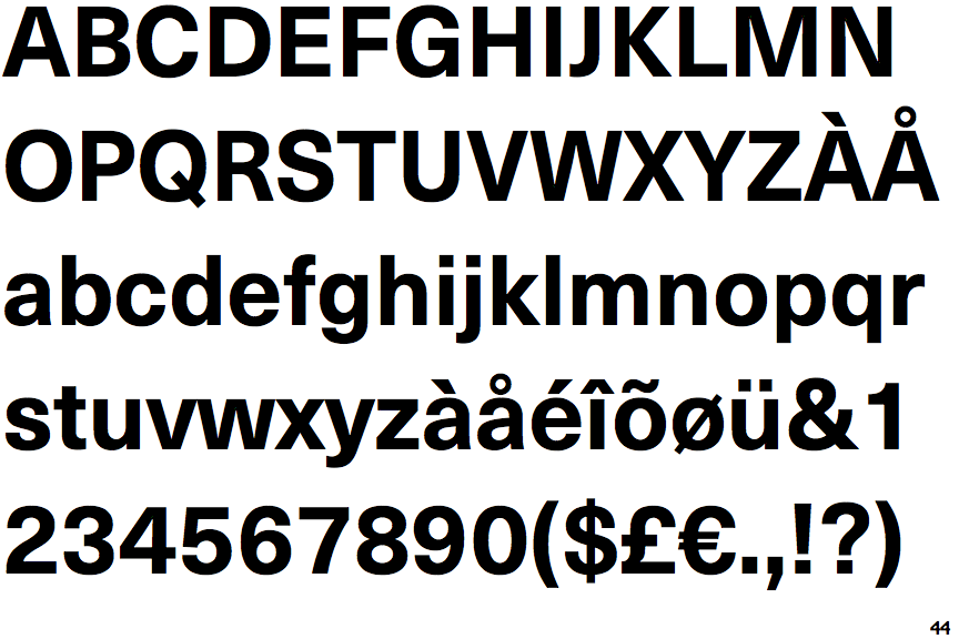
Neue Haas Unica Bold

Neue Haas Unica Bold

Crosses
The upper-case 'Q' tail crosses the circle.
Single
The diagonal strokes of the upper-case 'K' meet at the vertical (with or without a gap).
1-Storey
The lower-case 'g' is single-storey (with or without loop).
Outwards
The leg of the upper-case 'R' is curved outwards.
Left
The tail of the lower-case 'y' is curved or U-shaped to the left.

Note that the fonts in the icons shown above represent general examples, not necessarily the two fonts chosen for comparison.

Show Examples
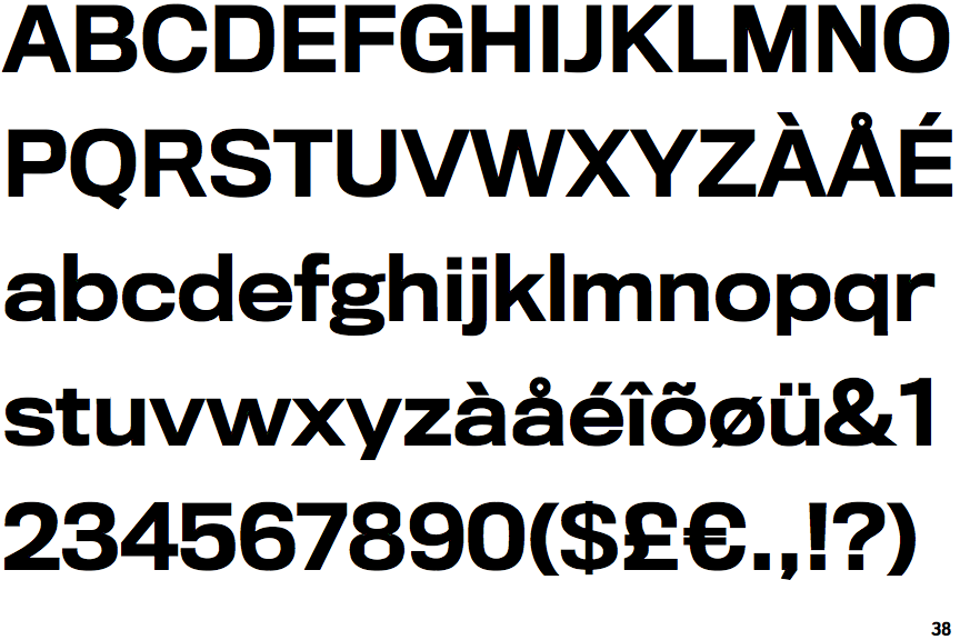
Titling Gothic Medium

Titling Gothic Medium

Touches
The upper-case 'Q' tail touches the circle.
Double
The diagonal strokes of the upper-case 'K' meet in a 'T'.
2-Storey
The lower-case 'g' is double-storey (with or without gap).
Straight
The leg of the upper-case 'R' is straight.
Straight
The tail of the lower-case 'y' is substantially straight.